How to Embed and Style a Donation Form in Webflow: Making Third-Party Widgets Match Your Nonprofit Site
Style a Donation Form in Webflow
Embedding a donation form in Webflow is straightforward. Making it look like it belongs on your site is the challenge. Third-party donation widgets — from Fundraise Up, Donorbox, every.org, Givebutter, and others — arrive with their own styling that rarely matches your brand. The result is a donation page that feels disjointed at precisely the moment you need donors to trust the process.
This guide covers practical techniques for styling embedded donation forms to match your Webflow site. For the basic embedding process itself, see How to Embed a Donation Form in Webflow.
Understanding What You Can and Cannot Control
Donation form embeds come in two types, and each has different styling constraints.
Inline embeds (iframes). Donorbox, every.org, and Givebutter typically embed as iframes — a page within a page. You cannot directly style the content inside an iframe with your site’s CSS because the iframe loads content from a different domain. What you can control is the container around the iframe: width, padding, background colour, border radius, and responsiveness.
Modal/overlay embeds. Fundraise Up operates as a modal overlay triggered by a button click. The modal has its own styling interface within the Fundraise Up dashboard where you can adjust colours, fonts, and layout to match your brand. You control the trigger button on your Webflow page (which you can style fully) and the modal appearance through the donation platform’s settings.
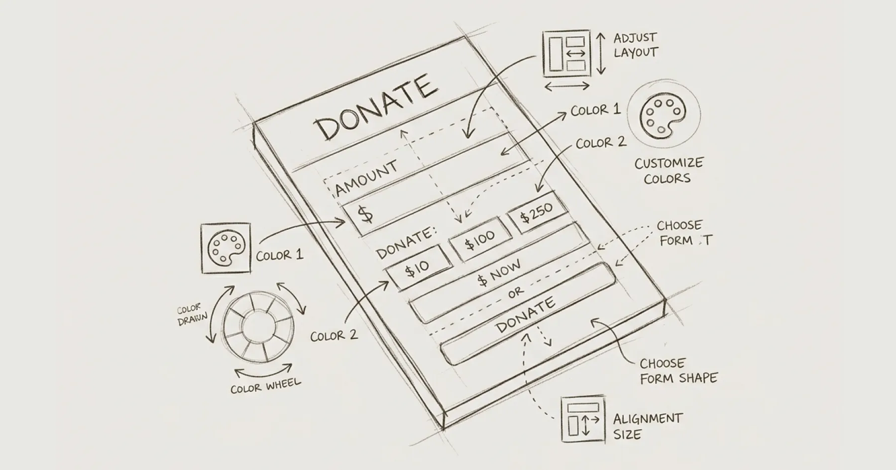
Styling the Container (All Platforms)
Regardless of which platform you use, the Webflow container around the embed should be styled to create visual cohesion.
Width constraint. Centre the embed container and set a max-width of 600–700px. A full-width donation form feels overwhelming. A contained, centred form feels focused and intentional.
Background contrast. Give the embed container a subtle background colour that distinguishes it from the page content — a light grey or your brand’s lightest neutral. This frames the donation form as a distinct, important element.
Padding and spacing. Add generous padding (40–60px on desktop, 20–30px on mobile) around the embed. Cramped donation forms reduce trust. Give the form room to breathe.
Mobile responsiveness. The container should be 100% width on mobile with reduced padding. Test the full donation flow on a mobile device — not just the form display but the entire payment completion process. Many donation forms break on mobile at the payment step rather than the form display step.
Platform-Specific Styling
Fundraise Up. Configure brand colours, button styles, and fonts in the Fundraise Up dashboard under Campaign settings. Match the primary button colour to your site’s CTA button colour. Match the font family if Fundraise Up supports it (they offer limited font options). The trigger button on your Webflow page should be styled as your standard CTA button — same colour, same size, same hover state.
Donorbox. Donorbox offers some theming options within their dashboard. Set the accent colour to match your brand’s primary colour. For the iframe container in Webflow, remove the default border Donorbox applies by wrapping the embed in a styled div with overflow: hidden and your desired border radius.
every.org. every.org’s embed widget is relatively minimal and adapts reasonably to container styling. Focus on container width and background to create visual integration.
Givebutter. Givebutter offers customisation options for button colours and form layout within their platform. Match these to your brand guidelines before embedding.
Testing the Styled Form
After styling, test the complete donation flow on three devices: desktop, tablet, and mobile phone. Test with at least two browsers (Chrome and Safari cover most users). Check that: the form loads without layout shifts, all fields are accessible by keyboard, the payment step completes successfully, and the confirmation message or redirect works correctly.
Do not assume styling changes are purely cosmetic. CSS changes to container elements can occasionally affect how the embedded form renders, particularly on mobile. Always test the full flow after making styling changes.
For the accessibility requirements that apply to donation forms, see WCAG AA Accessibility on Webflow. For the platform comparison to help choose the right donation tool, see Donation Software for Nonprofits.
Eric Phung has 7 years of Webflow development experience, having built 100+ websites across industries including SaaS, e-commerce, professional services, and nonprofits. He specialises in nonprofit website migrations using the Lumos accessibility framework (v2.2.0+) with a focus on editorial independence and WCAG AA compliance. Current clients include WHO Foundation, Do Good Daniels Family Foundation, and Territorio de Zaguates. Based in Manchester, UK, Eric focuses exclusively on helping established nonprofits migrate from WordPress and Wix to maintainable Webflow infrastructure.

Not sure where your site currently stands?
A Blueprint Audit tells you exactly what needs to change — and why.
Before implementing anything new, it's worth knowing what your current site is and isn't doing for your stakeholders. The Blueprint Audit gives you that clarity in two to three weeks.
Related Resources
Style a Donation Form in Webflow
Practical techniques for styling embedded donation forms from Fundraise Up, Donorbox, every.org, and Givebutter to match your Webflow nonprofit site — covering CSS overrides, container styling, and mobile responsiveness.
Join our newsletter
Subscribe to my newsletter to receive latest news & updates