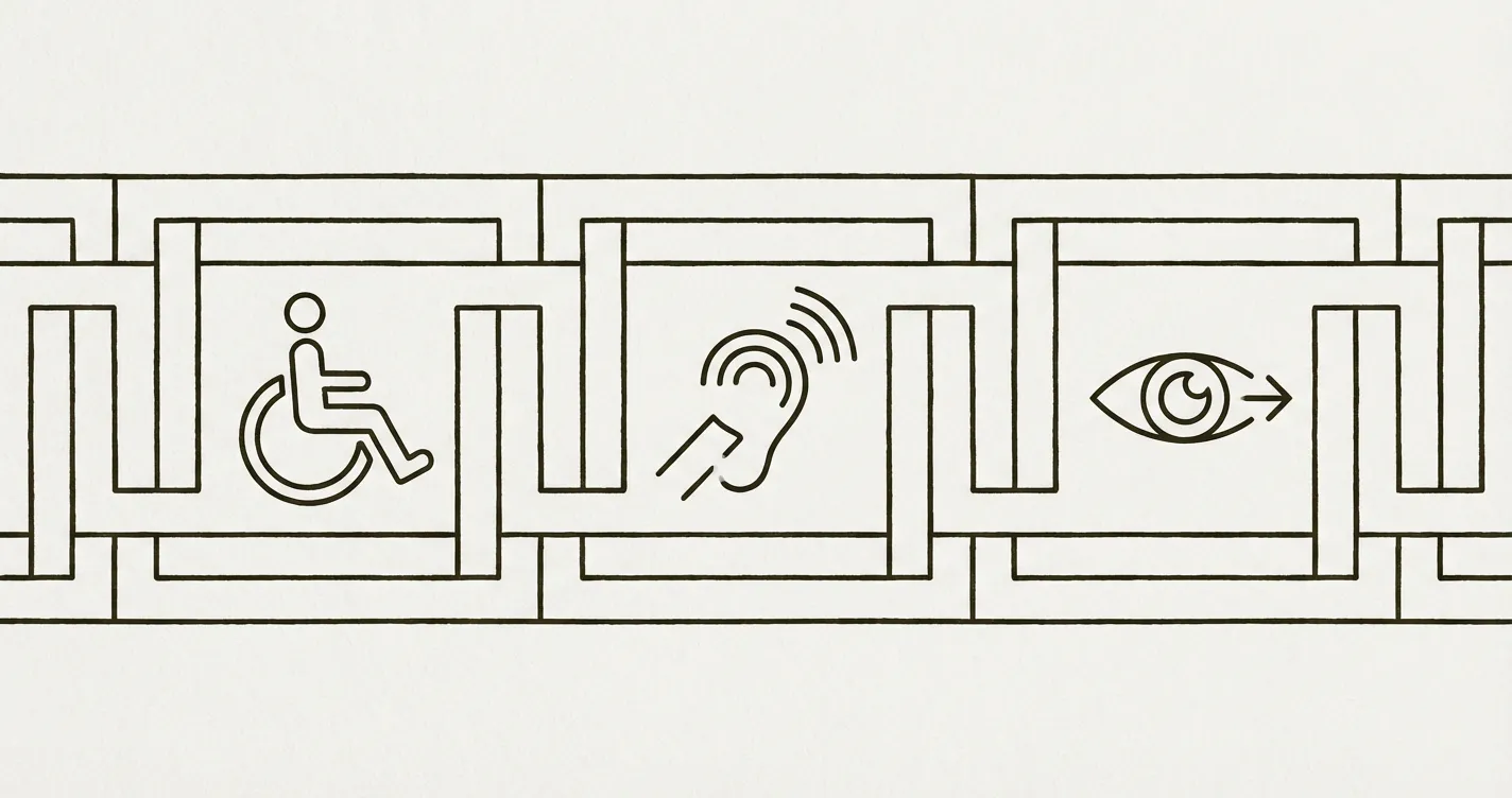
WCAG AA Accessibility on Webflow: A Practical Guide for Nonprofits
How to implement WCAG AA accessibility on a Webflow nonprofit website — covering the Lumos framework, focus styles, ARIA labels, testing tools, and what automated checks miss.

WCAG AA Accessibility on Webflow: A Practical Guide for Nonprofits
What WCAG AA Means for Your Nonprofit Website
WCAG (Web Content Accessibility Guidelines) is the international standard for digital accessibility. Level AA is the standard that matters for nonprofit organisations: it’s the level that UK equality law effectively requires, that the European Accessibility Act references via EN 301 549, and that institutional funders are increasingly evaluating during due diligence.
WCAG AA compliance is not a design preference. It’s a governance obligation. An inaccessible website excludes donors, beneficiaries, Board members, and stakeholders with disabilities — and creates regulatory exposure that the Board has fiduciary responsibility to manage.
This guide covers how WCAG AA compliance works on Webflow specifically, what the framework handles, what requires manual attention, and how to maintain compliance as an ongoing governance practice.
What the Lumos Framework Handles
I build all nonprofit Webflow sites on the Lumos framework (v2.2.0+). Lumos provides an accessible foundation that eliminates the most expensive structural accessibility failures:
- Semantic HTML structure: Correct heading hierarchy (H1 → H2 → H3), landmark regions (nav, main, footer), and semantic elements used throughout. This means screen readers can navigate the page structure logically.
- Keyboard navigation: All interactive elements are reachable and operable via keyboard. Focus states are visible. Tab order follows the visual layout. Skip-to-main-content links are built in.
- Focus management: Modals and overlays trap focus correctly. When an overlay closes, focus returns to the trigger element. Dropdown menus are keyboard-navigable.
- Responsive behaviour: Content reflows at all viewport sizes without horizontal scrolling. Touch targets meet minimum size requirements on mobile.
- ARIA attributes: Where native HTML semantics are insufficient (custom components, interactive widgets), ARIA roles, states, and properties are correctly applied.
These structural elements are the most expensive to retrofit on an existing site. Building on Lumos means they’re present from the start, which shifts the ongoing compliance work from structural remediation to content-level maintenance.
What Requires Manual Attention
Even on an accessible framework, content-level accessibility requires ongoing human attention. The framework cannot know what your images mean or whether your link text is descriptive. These are the areas that need consistent editorial discipline:
Image Alt Text
Every meaningful image needs a descriptive alt attribute that conveys the image’s purpose in context. Decorative images need an empty alt attribute (alt="") so screen readers skip them.
In Webflow, alt text is set when the image is uploaded or in the image element settings. For CMS-driven content, alt text is a field on the collection item.
Common failures: missing alt text entirely, alt text that describes the image literally rather than its purpose ("photo of people" vs "programme participants at the Manchester workshop"), and decorative images with descriptive alt text (causing screen readers to announce irrelevant information).
Colour Contrast
WCAG AA requires a minimum contrast ratio of 4.5:1 for normal text and 3:1 for large text (18px+ or 14px+ bold). This applies to all text on the site, including text on coloured backgrounds, text on images, button text, and link text.
Check contrast using the WebAIM Contrast Checker or browser developer tools. The most common failures on nonprofit sites: light grey text on white backgrounds, text overlaid on photographs without sufficient contrast, and link colours that don’t meet the ratio against their background.
Link Text
Links should be descriptive out of context. "Click here" and "read more" fail because a screen reader user navigating by links hears a list of meaningless phrases. Instead: "Read the annual report" or "Contact the programmes team."
Form Accessibility
Every form field needs a visible label (not just placeholder text, which disappears on focus). Error messages must be descriptive and associated with the relevant field. Forms must be completable by keyboard alone.
In Webflow, ensure every input has a label element linked to it. If using custom form styling, verify that the label association is maintained in the rendered HTML.
Video and Audio
Video content needs captions. Audio content needs transcripts. Captions must be synchronised and accurate — auto-generated captions should be reviewed and corrected.
Testing Your Site
Automated Testing
Automated tools catch approximately 30–40% of WCAG issues. They’re essential for baseline monitoring but insufficient for compliance on their own.
- axe DevTools: Free browser extension. Run on any page to get a list of violations with severity levels and remediation guidance. This should be your monthly monitoring tool.
- WAVE: Free browser extension from WebAIM. Provides a visual overlay showing accessibility issues in context on the page.
- Lighthouse: Built into Chrome DevTools. Includes an accessibility score based on automated checks.
Manual Testing
The remaining 60–70% of WCAG issues require manual testing:
- Keyboard navigation: Press Tab through the entire page. Can you reach every interactive element? Is focus visible? Can you operate menus, forms, and buttons without a mouse?
- Screen reader testing: Test with NVDA (Windows, free) or VoiceOver (Mac, built-in). Navigate the homepage. Can you understand the page structure? Are images described? Are forms usable?
- Heading hierarchy: Install the HeadingsMap browser extension and verify the heading structure is logical and sequential on every page template.
Maintaining Compliance Over Time
Accessibility is not a one-time project. New content, new pages, and platform updates can all introduce failures. The governance cadence I recommend:
- Monthly: Run axe DevTools on the homepage. Note the violation count and trend. If it’s increasing, investigate.
- Quarterly: Run axe on three key pages (homepage, programme page, donation page). Manual keyboard test on the donation flow. Review alt text on recently published content.
- Annually: Full manual accessibility audit across all page templates. Screen reader testing. Contrast review. Update the accessibility statement with findings.
- After significant site changes: Any new page template, navigation change, or component addition should be tested before going live.
For the accessibility statement your organisation needs, see Accessibility Statement Template for Nonprofits.
For how to conduct the full audit, see Technical SEO Audit for Nonprofits which covers accessibility alongside other technical checks.
For the governance context behind accessibility investment, see WCAG Accessibility as a Nonprofit Governance Obligation.
If you want to assess where your site stands before committing to remediation, the Blueprint Audit includes a full WCAG AA accessibility assessment as part of the technical review.
Further Reading
Eric Phung has 7 years of Webflow development experience, having built 100+ websites across industries including SaaS, e-commerce, professional services, and nonprofits. He specialises in nonprofit website migrations using the Lumos accessibility framework (v2.2.0+) with a focus on editorial independence and WCAG AA compliance. Current clients include WHO Foundation, Do Good Daniels Family Foundation, and Territorio de Zaguates. Based in Manchester, UK, Eric focuses exclusively on helping established nonprofits migrate from WordPress and Wix to maintainable Webflow infrastructure.
Not sure where your site currently stands?
A Blueprint Audit tells you exactly what needs to change — and why.
Before implementing anything new, it's worth knowing what your current site is and isn't doing for your stakeholders. The Blueprint Audit gives you that clarity in two to three weeks.
Related Resources
WCAG AA Accessibility on Webflow: A Practical Guide for Nonprofits
How to implement WCAG AA accessibility on a Webflow nonprofit website — covering the Lumos framework, focus styles, ARIA labels, testing tools, and what automated checks miss.
Join our newsletter
Subscribe to my newsletter to receive latest news & updates