25 Nonprofit Websites That Solve Complex Stakeholder Challenges
Discover 25 nonprofit websites that excel at serving multiple stakeholders—Boards, donors, and beneficiaries. Learn governance-focused design strategies for NGOs.


Summary
Nonprofit website examples are easy to find and hard to evaluate. Most best-nonprofit-websites roundups are curated on aesthetic grounds — the sites that look impressive in screenshots, with strong visual identities and generous use of white space. Aesthetic quality is relevant but it is not the criterion that determines whether a nonprofit website is actually serving its institutional function.
The websites that serve as genuine models for governance-focused nonprofit web strategy are the ones that serve multiple stakeholder groups without sacrificing any of them, communicate governance transparency in a way that builds funder confidence, maintain WCAG accessibility under real editorial conditions, and present impact evidence in a way that is both compelling for donors and verifiable for institutional grant-makers.
This post reviews 25 nonprofit websites that perform well against governance criteria: multi-stakeholder navigation that gives different audiences clear pathways to what they need, governance sections that are findable and current rather than buried and outdated, impact presentation that connects evidence to the theory of change rather than presenting decontextualised statistics, and accessibility implementations that have been maintained under real-world editorial conditions rather than only at launch. Each example includes a specific observation about what it does well and why. The selection spans UK, European, and international organisations across multiple cause areas and income levels.
25 Nonprofit Website Examples Solving Stakeholder Challenges
Leading a nonprofit's digital presence means balancing the needs of Boards demanding transparency, donors requiring accountability, and beneficiaries needing accessible services. Your website isn't just marketing—it's governance infrastructure that shapes how stakeholders perceive your institutional credibility.
Over my seven years building websites across multiple sectors—from tech startups to manufacturing firms—I've worked with 5-10 nonprofit organisations, and these projects taught me something critical: nonprofits face design challenges commercial agencies rarely encounter. The complexity of serving Boards, major donors, grant-makers, and beneficiaries simultaneously demands a completely different approach than selling products online.
That's precisely why I'm transitioning my consultancy to focus exclusively on nonprofits and NGOs. After working across 100+ websites in various industries, I've realised the nonprofit sector needs specialists who understand institutional governance, not just beautiful design. The repeated solutions nonprofits require—stakeholder navigation, financial transparency, compliance integration—allow me to deliver better outcomes than jumping between unrelated projects.
In this post, I'll share 25 nonprofit and foundation websites that excel at stakeholder communication. I analyse these examples with prospective clients during Blueprint Audit diagnostics to demonstrate how strategic design choices support governance requirements whilst maintaining accessibility and trust.
Why Nonprofit Websites Require Different Thinking
Unlike commercial sites optimised for single conversion goals, nonprofit websites must simultaneously serve:
- Board members seeking annual reports, financial statements, and governance documents
- Major donors requiring impact metrics and transparency into fund allocation
- Grant-makers evaluating institutional capacity and compliance
- Beneficiaries needing accessible information about services
- The public assessing your organisation's credibility and mission
In my commercial work, I could focus on driving conversions for a single customer type. With nonprofits, I've learned that success means creating clear pathways for five different audiences—each with distinct information needs and assessment criteria. This institutional complexity is why I've developed a diagnostic-first approach rather than jumping straight to design mockups.
The following examples show how leading nonprofits solve these multi-stakeholder challenges.
Foundations & Large NGOs: Institutional Credibility
1. Bill & Melinda Gates Foundation
Visit: gatesfoundation.org

The Gates Foundation's website exemplifies institutional transparency. I often show this example to clients because their homepage immediately addresses stakeholder priorities: impact data for donors, programme details for beneficiaries, and governance information for Board oversight. Their approach to presenting complex financial data whilst maintaining accessibility demonstrates what I aim to help clients achieve—balancing competing stakeholder needs without creating fragmented experiences.
Key lessons I highlight: Clear navigation hierarchy for different audiences, prominent annual report access, impact metrics presented visually, accessibility compliance evident throughout.
2. Wellcome Trust
Visit: wellcome.org
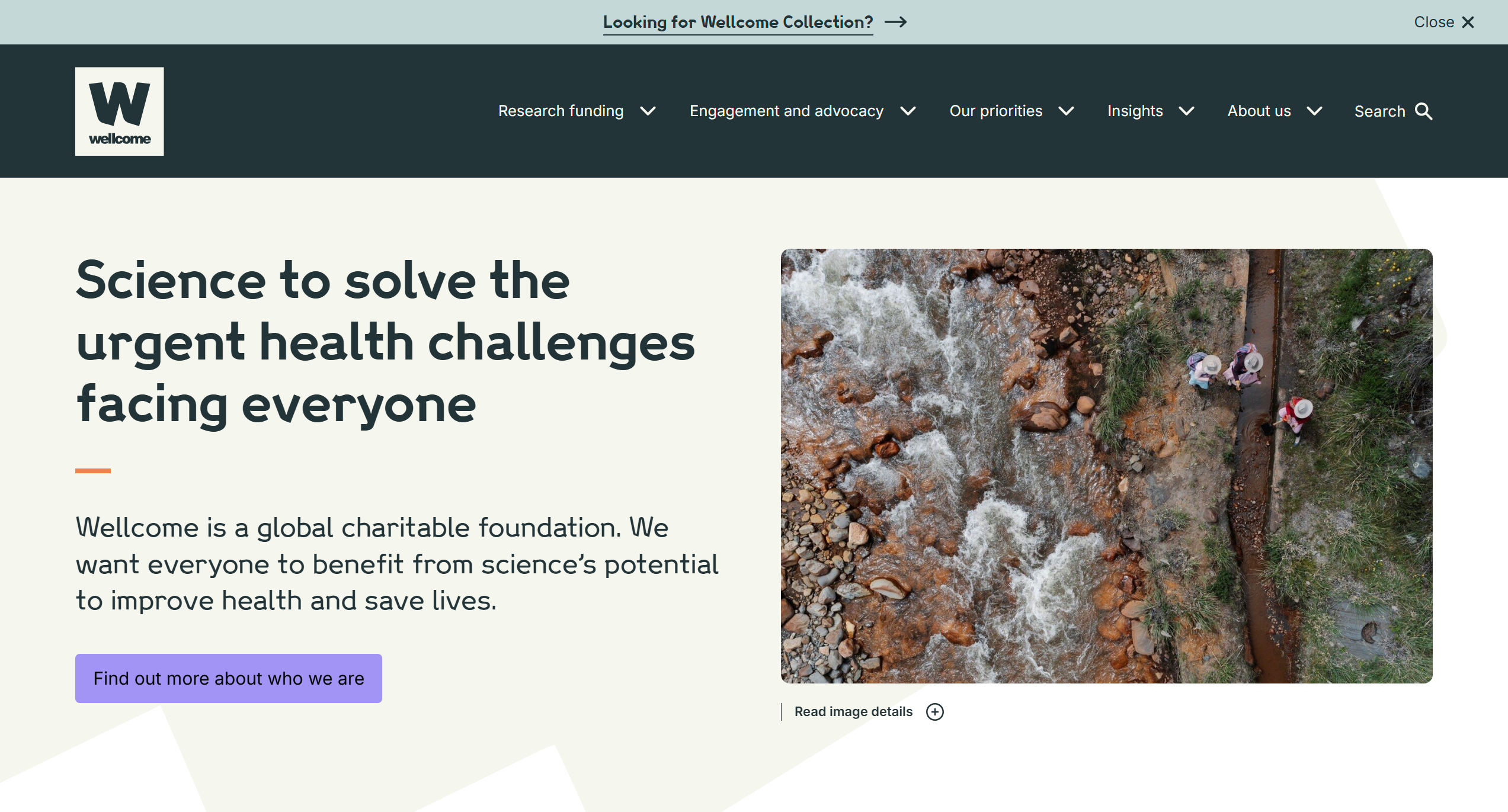
Wellcome demonstrates how research-focused foundations can present complex scientific work to non-specialist stakeholders. When I work with clients doing technical or specialized work, I reference Wellcome's governance section as exemplary transparency around decision-making processes, investment strategies, and organisational structure—essential for maintaining institutional trust with both scientific and public audiences.
Key lessons I highlight: Simplified complex information for diverse audiences, comprehensive governance documentation, clear funding criteria that helps grant-seekers understand eligibility before applying.
3. Ford Foundation
Visit: fordfoundation.org

Ford Foundation's website architecture reflects strategic stakeholder segmentation—exactly what I recommend in Blueprint Sprint diagnostics. Different entry points serve grant-seekers, researchers, and transparency-focused visitors. I particularly appreciate their annual reports presented as interactive experiences rather than static PDFs, increasing engagement whilst maintaining rigorous financial disclosure.
Key lessons I highlight: Audience-specific navigation pathways, interactive financial reporting, prominent social justice messaging aligned with mission.
4. Open Society Foundations
Visit: opensocietyfoundations.org

Operating across multiple regions and issue areas, Open Society Foundations demonstrates how complex organisational structures can be presented clearly. When I work with multi-affiliate clients, I reference their approach to multi-country operations with consistent branding whilst respecting local contexts.
Key lessons I highlight: Multi-regional content management, consistent governance messaging across geographies, transparent leadership structures that work at scale.
5. Rockefeller Foundation
Visit: rockefellerfoundation.org
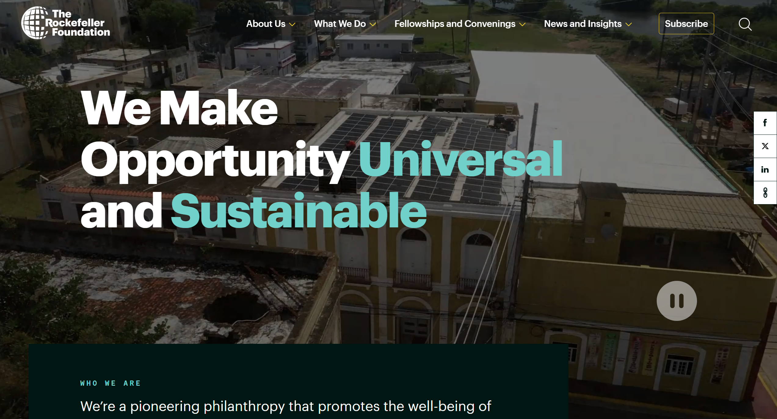
Rockefeller balances historical institutional weight with contemporary digital accessibility. I show this to clients with long histories who worry that modern web design might diminish their gravitas. Their website demonstrates how established organisations can modernise digital presence whilst maintaining the authority expected by major funders and institutional partners.
Key lessons I highlight: Heritage messaging integrated with modern design, comprehensive initiative tracking, clear impact measurement frameworks.
International NGOs: Multi-Stakeholder Navigation
6. Médecins Sans Frontières (MSF)
Visit: msf.org

MSF's website manages extraordinary complexity: emergency appeals for public donors, transparency reporting for institutional funders, recruitment for medical professionals, and field updates for media. I consider their navigation structure a masterclass in audience segmentation without fragmenting brand identity—something I aim to replicate in my client work.
Key lessons I highlight: Emergency response integration, financial transparency for multiple currencies, ethical imagery guidelines evident in photo selection.
7. Oxfam International
Visit: oxfam.org

Operating as a confederation of national organisations, Oxfam demonstrates federated governance in digital form. When I encounter clients with affiliate structures, I reference Oxfam's approach to maintaining consistent messaging whilst allowing affiliate autonomy—a governance challenge that requires careful information architecture.
Key lessons I highlight: Federated content management, clear affiliate relationships, transparent governance across multiple legal entities.
8. Save the Children
Visit: savethechildren.net
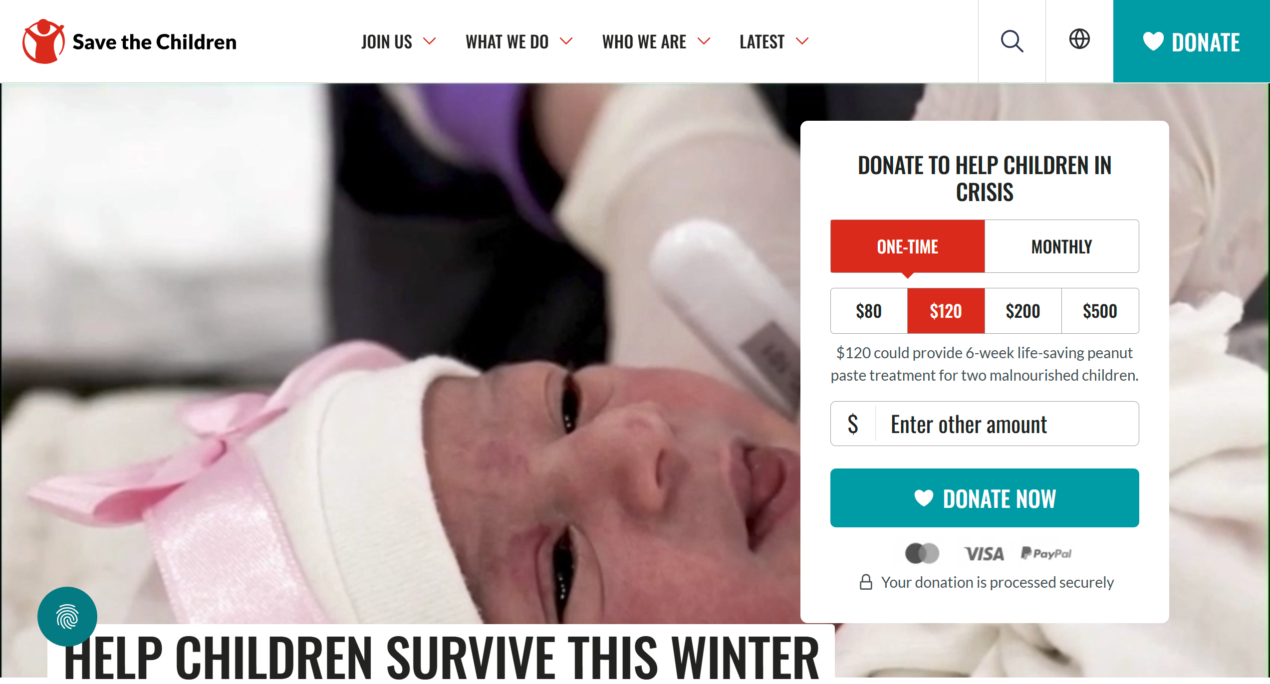
Save the Children balances urgent fundraising needs with institutional accountability. I show this to clients worried that transparent overhead disclosure might harm fundraising—their website demonstrates how emotional appeals can coexist with rigorous financial transparency, maintaining both public donations and institutional grant funding.
Key lessons I highlight: Ethical beneficiary photography, transparent overhead ratios, clear programme outcome reporting.
9. World Wildlife Fund (WWF)
Visit: worldwildlife.org
%20Endangered%20Species%20Conservation_%20-%20%5Bwww.worldwildlife.org%5D.png)
WWF's digital presence demonstrates environmental advocacy combined with scientific rigour. I reference this when working with clients who have specialized technical expertise—their approach to presenting complex conservation data to diverse audiences shows how knowledge can be made accessible without losing authority.
Key lessons I highlight: Scientific credibility maintained alongside public engagement, corporate partnership transparency, clear conservation metrics.
10. CARE International
Visit: care-international.org

CARE's website exemplifies long-term development work communication. Unlike emergency-focused organisations, they demonstrate sustained impact over decades. I show this to clients doing multi-year programme work, as it requires different storytelling approaches and governance transparency around long-term commitments.
Key lessons I highlight: Long-term impact tracking, gender-focused programme presentation, transparent reporting on overhead and programme ratios.
UK Charities: Regulatory Compliance & Transparency
11. British Red Cross
Visit: redcross.org.uk

British Red Cross demonstrates UK charity sector best practices that I build into every UK client project: prominent Charity Commission registration, clear trustees information, accessible annual accounts. I reference their website to show clients how regulatory compliance requirements can enhance rather than detract from user experience.
Key lessons I highlight: Charity Commission compliance integrated seamlessly, trustee information accessible within two clicks, clear gift designation options for donor trust.
12. Mind
Visit: mind.org.uk

Mind's mental health services require particularly careful stakeholder communication—vulnerable beneficiaries need accessible crisis support whilst funders require outcome metrics. I show this to clients serving vulnerable populations to demonstrate how sensitive subject matter can be handled with both compassion and institutional accountability.
Key lessons I highlight: Crisis support prominent, accessibility compliance exemplary (WCAG AA), outcome reporting sensitive to beneficiary privacy.
13. Macmillan Cancer Support
Visit: macmillan.org.uk

Macmillan balances direct service provision with advocacy work. I reference this when working with operational charities that do both programme delivery and policy work—their website demonstrates how to present both aspects to different stakeholder groups without creating confusion.
Key lessons I highlight: Service directory functionality, volunteer management integration, professional audience sections alongside public-facing content.
14. The National Trust
Visit: nationaltrust.org.uk

With 5.6 million members, the National Trust's website must serve membership administration, visitor information, conservation reporting, and fundraising simultaneously. I show this to large-membership organisations to demonstrate how membership communication works alongside charitable governance transparency.
Key lessons I highlight: Membership portal integration, conservation transparency, property management communications, volunteer coordination at scale.
15. Shelter
Visit: shelter.org.uk

Shelter combines direct advice services with housing advocacy. I reference this when working with campaigning organisations that need to balance activist messaging with the institutional credibility required for government engagement and major grant funding—a tricky balance that Shelter handles well.
Key lessons I highlight: Service provision alongside advocacy, clear policy positions without alienating institutional funders, accessible legal advice integration.
Healthcare & Research: Specialist Stakeholder Needs
16. Cancer Research UK
Visit: cancerresearchuk.org

As the UK's largest cancer charity, CRUK manages multiple stakeholder groups: research scientists, fundraising participants, patients seeking information, and institutional grant-makers. I study their architecture when working with research-focused charities because they demonstrate sophisticated audience segmentation without creating disconnected experiences.
Key lessons I highlight: Research transparency for academic credibility, patient information accessibility, fundraising event management, clear overhead and research spending ratios.
17. British Heart Foundation
Visit: bhf.org.uk

BHF demonstrates how retail charity operations can be integrated into digital presence without detracting from research missions. I show this to clients with diversified funding models—shops, grants, donations—to demonstrate multi-revenue-stream communication.
Key lessons I highlight: Retail integration, research impact communication, clear funding allocation transparency.
18. Alzheimer's Society
Visit: alzheimers.org.uk

Alzheimer's Society serves particularly diverse stakeholders: people with dementia, family carers, healthcare professionals, researchers, and policymakers. I reference their information architecture when clients feel overwhelmed by multiple audiences—their website demonstrates how complex care pathways can be communicated clearly whilst maintaining governance transparency.
Key lessons I highlight: Care pathway clarity, professional resources separated from public information, research funding transparency, advocacy positioning for policy influence.
Arts & Culture: Mission Communication
19. Tate
Visit: tate.org.uk

Tate's digital presence demonstrates how cultural institutions balance public engagement, institutional fundraising, and governance transparency. I show this to arts organisations to demonstrate how financial information can be presented alongside programming without undermining artistic mission.
Key lessons I highlight: Institutional governance integrated with public programming, major donor recognition balanced with accessibility, clear funding source attribution.
20. British Museum
Visit: britishmuseum.org

The British Museum's website handles extraordinary complexity: global scholarship, public education, trustee accountability, and controversial collections management. I reference their approach to transparency around contested heritage to show clients that difficult institutional conversations can be supported through digital governance—you don't have to hide complexity.
Key lessons I highlight: Collections transparency, trustee information prominent, funding source disclosure, ethical acquisition policies clearly stated.
Education & Youth: Safeguarding Considerations
21. The Prince's Trust
Visit: princes-trust.org.uk

Working with young people requires particular attention to safeguarding in digital communications. I ensure every youth-serving client project includes prominent safeguarding policies—The Prince's Trust demonstrates how to balance accessibility for beneficiaries with governance requirements around child protection and data protection.
Key lessons I highlight: Safeguarding policies prominent, age-appropriate communication, outcome metrics that respect beneficiary privacy, clear corporate partnership governance.
22. Barnardo's
Visit: barnardos.org.uk

Barnardo's extensive service provision across children's social care requires sophisticated stakeholder communication. I reference this when working with commissioned service providers—their website demonstrates how to maintain transparency around outcomes whilst protecting vulnerable children's identities.
Key lessons I highlight: Service commissioning information for local authorities, safeguarding prominence, impact reporting that protects beneficiary identities.
Environmental & Conservation: Data Visualisation
23. The Nature Conservancy
Visit: nature.org
.png)
Environmental organisations must present complex scientific data to non-specialist stakeholders. I reference The Nature Conservancy when working with technically complex clients—their approach demonstrates how conservation metrics can be visualised for donor understanding whilst maintaining scientific rigour.
Key lessons I highlight: Scientific credibility through data transparency, impact visualisation for non-specialists, clear land acquisition governance.
24. ClientEarth
Visit: clientearth.org
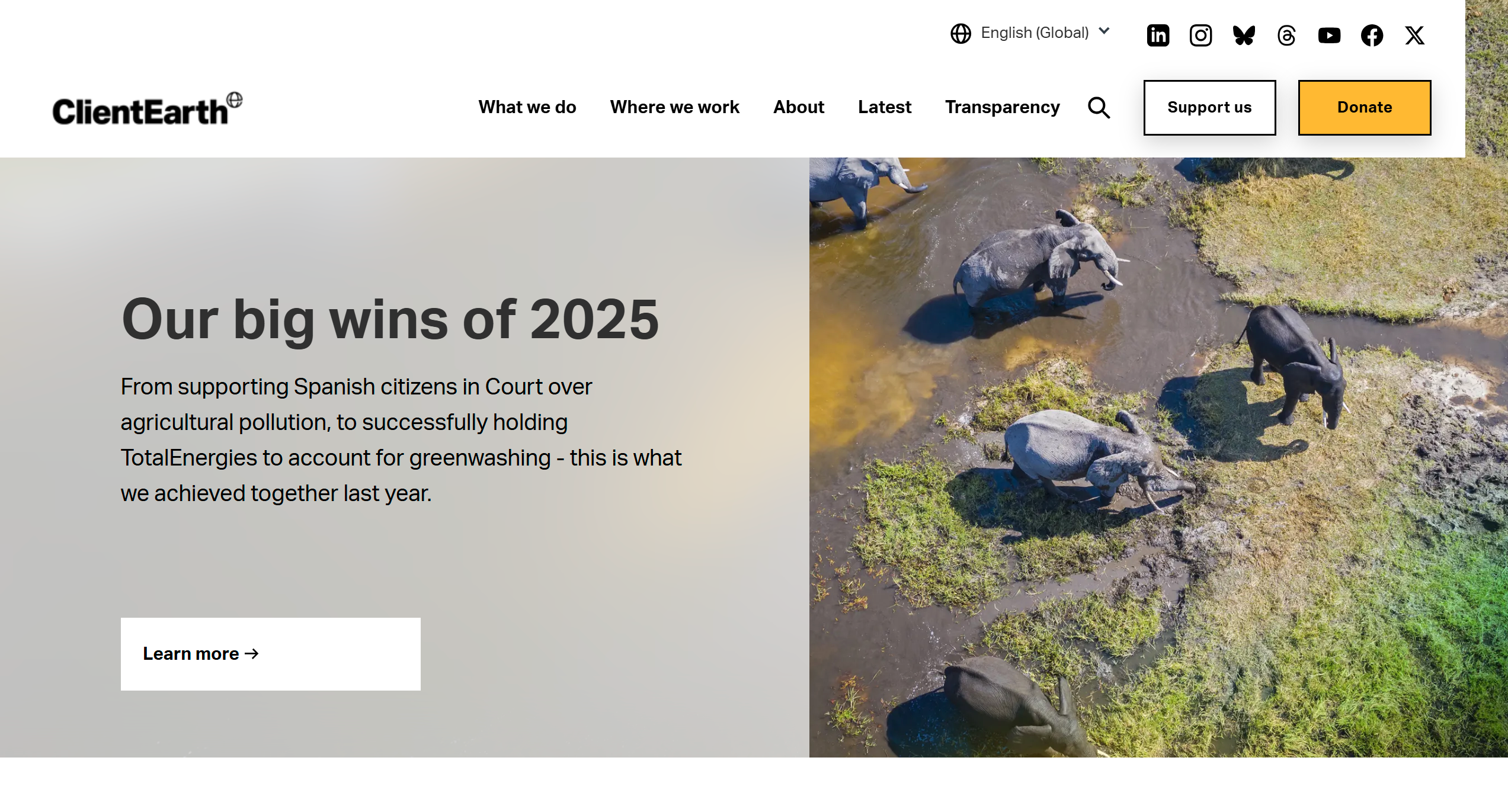
As an environmental law organisation, ClientEarth demonstrates how specialist technical work can be communicated to diverse audiences. I show this to clients doing complex technical work that requires stakeholder explanation—legal cases, research findings, policy analysis.
Key lessons I highlight: Legal case transparency, outcome tracking for funders, technical explanation for non-specialists, governance around litigation funding.
Community Foundations: Local Accountability
25. London Community Foundation
Visit: londoncf.org.uk

Community foundations manage donor-advised funds, requiring particular governance transparency. I reference this when working with grantmaking organisations—London Community Foundation demonstrates how to present decision-making processes clearly whilst protecting individual donor privacy where requested.
Key lessons I highlight: Grantmaking criteria transparency, donor-advised fund explanation for prospective donors, grant outcomes reporting, clear overhead disclosure.
Common Patterns in Successful Nonprofit Websites
Analysing these 25 examples has shaped how I approach client projects. I've identified consistent patterns that differentiate institutional nonprofit web presences from commercial sites:
1. Governance Information Architecture
Every successful nonprofit website makes governance information easily accessible—not hidden in footer links. In my Blueprint Audit diagnostics, I assess whether Board composition, annual reports, financial statements, and regulatory compliance information are within two clicks of the homepage. This is non-negotiable for institutional credibility.
2. Multi-Stakeholder Navigation
Rather than single conversion funnels, these sites provide clear pathways for different audiences: "For Donors," "For Grant Seekers," "For Researchers," "For Service Users." I build this segmentation into information architecture from the start because trying to retrofit it later creates navigation chaos.
3. Financial Transparency
Leading nonprofits present financial information proactively rather than reactively. In my client work, I recommend overhead ratios, programme spending breakdowns, and largest grants be communicated clearly—this builds trust with all stakeholder groups rather than raising suspicion.
4. Impact Measurement
Beyond mission statements, these organisations demonstrate outcomes through metrics, case studies, and third-party evaluations. I help clients structure this evidence-based approach to support both fundraising and institutional accountability.
5. Accessibility Compliance
WCAG AA compliance isn't an afterthought but integrated throughout—reflecting nonprofit values around inclusion. I build accessibility testing into every project because service users with disabilities must access information, and grant-makers increasingly assess digital accessibility during due diligence.
Applying These Lessons: Why I'm Focusing on Nonprofits
After building 100+ websites across multiple sectors, I've learned that generalist work means reinventing solutions for every client. Each industry has unique challenges, but jumping between e-commerce, manufacturing, professional services, and nonprofits prevents me from developing deep expertise.
The nonprofit sector's repeated patterns—stakeholder navigation, governance transparency, compliance integration, impact reporting—allow me to deliver better outcomes through specialized knowledge. Rather than learning a new industry's requirements for each project, I can focus on solving the specific challenges Communications Directors face when serving Boards, donors, and beneficiaries simultaneously.
This specialization benefits my clients directly:
- I don't need to learn charity sector regulations from scratch on your project
- I understand institutional decision-making and Board approval processes
- I can reference specific examples relevant to your organizational type
- I've developed diagnostic frameworks specifically for nonprofit governance challenges
Key Questions I Use in Blueprint Audit Diagnostics:
- Can Board members find governance documents within two clicks?
- Is your financial transparency sufficient for institutional funders' due diligence?
- Do different stakeholder groups have clear navigation pathways?
- Are impact metrics presented in ways both specialists and generalists can understand?
- Does your accessibility compliance reflect your stated values around inclusion?
Blueprint Audit: My Diagnostic Approach
Through my work with 5-10 nonprofit clients and studying dozens more, I've developed a diagnostic framework specifically for nonprofits facing Board scrutiny around digital presence.
The Blueprint Audit is a £2,500 strategic engagement that I conduct before any design work begins. It assesses:
- Stakeholder mapping: Who actually uses your website and what governance information do they require?
- Compliance gaps: Where does your current site fall short of regulatory requirements or institutional expectations?
- Content architecture: How should governance, programme, and fundraising information be structured for your specific stakeholder mix?
- Implementation roadmap: What changes deliver maximum credibility improvement for available budget?
This diagnostic precedes implementation work, ensuring your Board approves investment based on clear strategic rationale rather than subjective design preferences. I've found that Communications Directors who bring comprehensive diagnostics to Board meetings get approval far more easily than those presenting design mockups alone.
Following the Blueprint Audit, implementation services range from £6,000 to £18,000 depending on organisational complexity and technical requirements.
Why I Developed This Approach
In my early nonprofit projects, I made the mistake of jumping straight to design proposals. Boards questioned everything: "Why this navigation?" "Why this colour?" "Why can't we just update the current site?"
Without strategic rationale, every design decision becomes subjective debate. The Blueprint Audit emerged from these painful experiences—it gives Boards the governance framework they need to evaluate digital investments as infrastructure rather than discretionary marketing spend.
Is Your Website Supporting or Undermining Institutional Credibility?
If your Board is questioning whether your website adequately represents your organisation's governance standards, or if you're struggling to serve multiple stakeholder needs with limited resources, the Blueprint Audit provides clarity without committing to full redesign costs upfront.
I work with Communications Directors at established nonprofits (typically £2-5m revenue) who face institutional complexity that commercial web designers don't understand. If you're dealing with Board scrutiny, major donor expectations, grant-maker due diligence, and beneficiary accessibility requirements simultaneously, I'd welcome a conversation about whether my focused approach might help.
Further reading:
Book a Blueprint Audit consultation to discuss how these examples might inform your organisation's specific stakeholder challenges.
What You Take Away From the Right Examples
The value of studying nonprofit website examples isn't inspiration — it's pattern recognition. Once you can see why a particular homepage works (specific headline, clear routing, one primary action), you can apply that structural thinking to your own site regardless of your budget, platform, or design constraints.
The organisations whose websites consistently perform well share a common characteristic: every design decision was made in service of a specific audience need, not an aesthetic preference. That discipline is what separates sites that are genuinely effective from sites that merely look professional.
Q1: What makes a nonprofit website example worth studying?
The most instructive examples are those where specific design and content decisions are traceable to specific stakeholder outcomes — not simply sites that look impressive. A site worth studying demonstrates clear multi-stakeholder routing, accessible design, transparent governance, and content that has been updated recently. Visual polish alone is not a reliable indicator of effectiveness. A beautifully designed site that buries annual reports and hides governance information teaches the wrong lessons.
Q2: What do effective nonprofit websites have in common structurally?
Regardless of visual style, effective nonprofit websites share: a homepage that routes multiple stakeholder groups to relevant content within two clicks, prominent governance information including trustee listings and annual reports, programme pages that describe outcomes rather than activities, WCAG AA accessibility compliance, content updated within the last 60 days, and a clear donation or contact pathway for each primary audience. These structural qualities predict effectiveness more reliably than design aesthetics.
Q3: Which nonprofit websites are most cited as examples of multi-stakeholder design?
Organisations that consistently solve multi-stakeholder navigation include WHO Foundation, Médecins Sans Frontières, Oxfam, and GiveDirectly — each taking a different architectural approach. What they share is explicit stakeholder routing from the homepage and content depth that serves each primary group's specific decision-making needs. The useful lesson is the structural principle, not the visual style — and it applies at any budget level.
Q4: What examples demonstrate effective nonprofit impact communication?
The most effective impact communication examples use specific numbers tied to specific outcomes in specific geographies and time periods. GiveDirectly and Against Malaria Foundation are frequently cited for rigorous, transparent impact communication where methodology is visible alongside results. The lesson: specificity creates credibility. '2,847 children vaccinated in rural Kenya between January and December 2024' is more compelling to a serious donor than 'thousands of children helped across Africa'.
Q5: How should a small nonprofit use larger NGO websites as examples?
With translation rather than imitation. A large international NGO's website architecture — multiple languages, extensive content libraries, complex navigation — reflects resources and complexity that smaller organisations don't have and don't need. The useful lessons are structural and strategic: how they route different audiences, how they present impact evidence, how they handle governance transparency. Extract the principles and apply them at appropriate scale rather than trying to replicate the complexity.
Q6: What nonprofit website mistakes appear most consistently in audits?
The most recurring problems across nonprofit website audits are: homepage headlines describing the organisation rather than serving the visitor, navigation organised around internal departments rather than stakeholder journeys, impact content that is aspirational rather than evidenced, governance sections that are missing or incomplete, and accessibility failures that exclude significant portions of the intended audience. These problems are sector-wide and not specific to any size or type of organisation.
Q7: What do websites that successfully support grant applications look like?
Sites that effectively support grant applications share specific characteristics: programme pages with measurable outcome descriptions, a current annual report prominently accessible, a trustee listing with named individuals and roles, a clearly stated charity registration number, evidence of safeguarding policies, and impact data presented with methodology. These elements serve the funder's due diligence process before any direct conversation happens — the website makes the application more credible before the reviewer reads a word of it.
Q8: Should nonprofits follow website trends seen in the commercial sector?
Selectively and with governance awareness. Some commercial trends genuinely improve nonprofit websites: accessibility standards, performance optimisation, mobile-first design, clear calls to action. Others are inappropriate: aggressive conversion optimisation that manipulates emotional responses, countdown timers on donation appeals, dark patterns that make consent withdrawal difficult. Nonprofits have specific accountability obligations that commercial sites don't — the website must demonstrate governance, not just convert visitors.
Q9: How can a nonprofit test whether their website is as effective as examples they admire?
Run a structured user test with representatives from each primary stakeholder group. Give them specific tasks — find the annual report, identify the primary beneficiary group, make a donation, find a press contact — without guidance and observe where they succeed and struggle. This produces specific, actionable findings rather than subjective comparisons. The gap between what admired examples achieve and what the current site achieves becomes concrete and addressable rather than vaguely aspirational.
Q10: What international nonprofit website examples should UK charities avoid copying directly?
US nonprofit websites often prioritise emotional storytelling over governance transparency in ways that don't meet UK funder expectations. Australian and Canadian sites operate under different regulatory frameworks. North American best practice for donation pages often uses urgency and social proof in ways that are inconsistent with ICO guidance on fair consent and fair processing. Borrow structural lessons but apply them within your specific regulatory and cultural context — UK charity audiences have different expectations around financial accountability and governance transparency than their US counterparts.
Is this familiar?
Most nonprofit websites don't fail at launch. They fail quietly, over time.
The governance gaps, the stakeholder confusion, the Board that's stopped referring people to the site — these don't announce themselves. See what the difference looks like when it's built correctly from the start.
Eric Phung has 7 years of Webflow development experience, having built 100+ websites across industries including SaaS, e-commerce, professional services, and nonprofits. He specialises in nonprofit website migrations using the Lumos accessibility framework (v2.2.0+) with a focus on editorial independence and WCAG AA compliance. Current clients include WHO Foundation, Do Good Daniels Family Foundation, and Territorio de Zaguates. Based in Manchester, UK, Eric focuses exclusively on helping established nonprofits migrate from WordPress and Wix to maintainable Webflow infrastructure.
Ready to understand your current situation clearly?
The Blueprint Audit is where we start.
A two-to-three week diagnostic that maps your stakeholder needs, audits your current site, and gives you a clear strategic brief before any implementation commitment is made. £2,500. No obligations beyond the audit itself.
In case you missed it
Explore more

Nonprofit Website Audit Checklist: What to Review Before a Rebuild

What Is Website Governance for Nonprofits? A Complete Guide

How to Choose a Website Consultant for Your Nonprofit
Join our newsletter
Subscribe to my newsletter to receive latest news & updates