Best Mobile Heading Sizes for Nonprofit Websites
The right mobile heading scale keeps your nonprofit site readable on every device. Here's the heading hierarchy that works — and why most nonprofit sites get it wrong.

Summary
Heading sizes on nonprofit websites are frequently set for desktop and neglected on mobile. The result is a site that looks composed on a large screen and reads as a wall of oversized text on a phone — which is where a growing proportion of donors, beneficiaries, and stakeholders are actually encountering it. The M+R Benchmarks report consistently shows that more than half of all nonprofit website traffic arrives on mobile devices, with the proportion higher still for social media-driven traffic.
This is not primarily an aesthetic problem. Heading sizes that are poorly calibrated for mobile screens create accessibility failures — text that is too large disrupts reading flow and makes the heading hierarchy difficult to process, while text that is too small fails minimum legibility standards. Both create barriers for the beneficiaries, older donors, and users with low vision who are among the primary audiences most nonprofit websites exist to serve.
This post covers the heading scale that works for nonprofit websites across mobile, tablet, and desktop — the specific size ratios, line heights, and viewport adjustments that maintain readable hierarchy without requiring the user to scroll through oversized headings to reach the content they need. It explains the CSS fluid typography approaches that handle this gracefully, the Webflow and Lumos framework settings that implement it correctly, and why most nonprofit sites get this wrong.
Best Mobile Heading Sizes for Nonprofit Websites
Most nonprofit websites use desktop heading sizes on mobile and hope for the best. The result is titles that dominate the entire screen, body text that feels cramped against oversized subheadings, and a reading experience that quietly undermines the credibility your organisation has spent years building.
This matters more than it sounds. When a funder reviews your site on a train, when a Board member checks the annual report summary from their phone, when a journalist pulls up your programmes page during a call — they are all seeing the mobile version. If the headings are unreadable, overlapping, or visually identical to body text, the site looks amateur at exactly the moment institutional credibility matters most.
Getting mobile heading sizes right is not a design preference. It is a governance decision about how your organisation presents itself to the people who fund, regulate, and scrutinise your work.
Why Nonprofit Sites Get This Wrong
Most nonprofit websites are designed desktop-first — often by an agency or freelancer who set heading sizes to look good on a 1440px screen and then left the mobile breakpoints to Webflow's defaults or a quick manual override. The result is one of three failure patterns I see repeatedly across nonprofit sites:
The first is headings that fill the entire viewport. An H1 set at 48px or larger on desktop, left unchanged on mobile, means the page title alone occupies the full screen before a visitor sees a single line of body text. On a programme page or impact report, this creates the impression that the site was never tested on a phone — which, frequently, it was not.
The second is subheadings that are visually identical to body text. When H3 and H4 sizes are not deliberately scaled for mobile, they collapse into the same visual weight as paragraph text. The heading hierarchy disappears, and the page becomes a wall of undifferentiated content. Visitors cannot scan. Funders cannot find what they need. The structure that makes your content navigable on desktop simply stops working.
The third is inconsistent sizing across CMS template pages. If heading sizes are set page-by-page rather than through a systematic framework, every blog post, programme page, and resource guide ends up with slightly different typography. The site feels unfinished — not because the content is poor, but because the presentation is inconsistent in ways that undermine professional credibility.
All three of these are avoidable with a deliberate mobile heading scale.
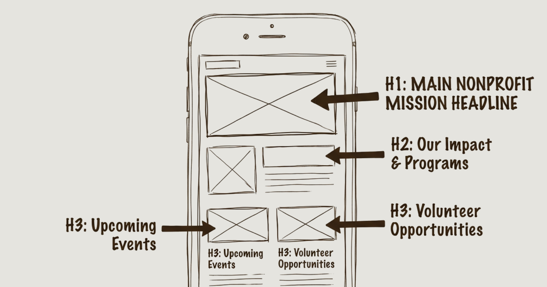
The Mobile Heading Scale That Works
A 1.33 ratio — sometimes called a perfect-fourth scale — works well for mobile because it keeps each heading level visually distinct without any single heading dominating the screen. The scale below assumes a 16px (1rem) base body text size, which is the browser default and the standard starting point for accessible typography.
H1: 32px (2rem) — the main page title. Used once per page. On mobile, 32px is large enough to establish clear hierarchy without filling the viewport. This is the hero heading on your homepage, the title on a programme page, or the headline on a blog post.
H2: 24px (1.5rem) — primary section headers. These divide the page into its major content blocks. On a programme page, these might be "What We Do," "Who We Serve," and "Our Impact." At 24px, they are clearly distinct from both the H1 above and the body text below.
H3: 18px (1.125rem) — subsections within an H2 block. These break longer sections into scannable chunks. At 18px on mobile, they sit comfortably between H2 and body text without collapsing into either.
H4: 16px (1rem) — the same size as body text, but distinguished through weight or styling. Used for minor structural labels, sidebar headings, or metadata categories. The visual distinction comes from bold weight or a different colour, not from size alone.
H5 and H6 are almost never needed on nonprofit websites. If your page structure requires five or six levels of heading, the content architecture likely needs rethinking rather than more heading levels. Forcing H5 and H6 into a page for completeness creates headings at 14px or 12px — sizes that fall below practical readability for many users, particularly on mobile in variable lighting conditions.
Line Height and Spacing
Getting the sizes right is only half the picture. Line height — the vertical space between lines of text within a heading — determines whether headings feel clean or cramped on a small screen.
For H1 and H2 headings on mobile, a line height between 1.1 and 1.3 keeps multi-line titles grouped tightly enough to read as a single unit. If the line height is too generous, a two-line H1 looks like two separate elements rather than one heading.
For body text, a line height of 1.5 remains the standard for comfortable reading. The contrast between tight heading spacing and more generous body spacing is what creates the visual rhythm that makes a page feel professionally structured.
Margins between headings and the content that follows them also matter. A heading should sit closer to the paragraph below it than to the content above it — this visual proximity signals that the heading belongs to what follows, not what came before. When this spacing is inconsistent, the page structure becomes ambiguous in ways that affect both readability and accessibility.
This Is an Accessibility Obligation, Not a Preference
Mobile heading sizes are directly connected to WCAG 2.1 AA compliance — the accessibility standard that applies to any nonprofit receiving public funding, serving people with disabilities, or operating under sector regulations that reference web accessibility.
Two WCAG success criteria are particularly relevant here. WCAG 1.4.4 (Resize Text) requires that text can be resized up to 200% without loss of content or function. If your headings are set in fixed pixel values, a user who has increased their device's default text size will not see your typography scale with their settings. Using relative units — rem rather than px — ensures that your heading scale respects the user's chosen text size. This is not optional for organisations with accessibility obligations.
WCAG 1.4.10 (Reflow) requires that content can be presented without requiring horizontal scrolling at 320px viewport width. Headings that are too large for mobile viewports force horizontal overflow or text truncation, both of which violate this criterion. A properly scaled heading hierarchy, starting at 2rem for H1, avoids this entirely.
Setting heading sizes in rem is the single most important technical decision for accessible mobile typography. It means your headings will scale fluidly with the user's preferences rather than fighting against them.
How This Works in Webflow With Lumos
The Lumos framework — which underpins all Socialectric builds — handles responsive typography through CSS clamp() functions rather than fixed values at individual breakpoints. This means heading sizes scale fluidly between a defined minimum and maximum as the viewport changes, rather than jumping abruptly from one size to another at tablet and mobile breakpoints.
The practical consequence is that there are no awkward intermediate states where a heading looks too large for the screen or too similar to the next heading level down. The typography adjusts continuously, maintaining the proportional relationships across every device width.
These values are managed through Webflow's native variables panel, which means the entire typographic scale can be reviewed and adjusted from a single location rather than hunting through individual element styles across dozens of pages. For organisations with large CMS-driven sites — programme pages, blog posts, resource libraries — this consistency is the difference between a site that feels deliberately designed and one that feels assembled piecemeal over time.
This is not something that happens by default. Webflow's out-of-the-box typography settings do not use clamp, do not enforce a consistent scale, and do not automatically adjust heading sizes for mobile. Achieving a coherent mobile heading hierarchy requires deliberate configuration — either through a framework like Lumos or through careful manual setup that most nonprofit teams do not have the technical capacity to maintain.
What This Looks Like in Practice
The difference between a nonprofit site with a deliberate mobile heading scale and one without is immediately visible — not as a design flourish, but as institutional seriousness.
A site with consistent, properly scaled headings communicates that someone is paying attention to how the organisation presents itself. A site where the H1 fills the screen, the H3 is indistinguishable from body text, and every CMS page has slightly different typography communicates the opposite — that the website is an afterthought rather than infrastructure.
For the audiences that matter most to nonprofits — institutional funders conducting due diligence, major donors assessing credibility, regulators checking public-facing compliance, journalists researching a story — this distinction registers. They may not articulate it as a typography problem. But they notice when a site feels professional and when it does not.
The Blueprint Audit includes a full mobile experience review as part of its technical scorecard — covering heading hierarchy, responsive behaviour, accessibility compliance, and how the site performs for the specific stakeholder groups that matter to your organisation. If your site's mobile experience is something you have not examined closely, that is often a sign there are governance-level findings worth surfacing.
Frequently Asked Questions
Question 1: What is the best H1 size for mobile?
32px (2rem) is the most effective H1 size for mobile screens. It is large enough to establish clear visual hierarchy as the page title without dominating the viewport. This assumes a 16px base body text size — the browser default. Using rem units rather than fixed pixels ensures the heading scales with the user's accessibility settings, which is a requirement under WCAG 2.1 AA.
Question 2: Should nonprofit websites use different heading sizes on mobile?
Yes. Desktop heading sizes do not translate directly to mobile screens. A 48px or 56px H1 that looks proportional on a 1440px desktop monitor will fill the entire screen on a phone, pushing all content below the fold. Nonprofit websites should use a scaled-down heading hierarchy on mobile — typically a 1.33 ratio scale starting at 32px for H1 — to maintain readability and professional presentation for donors, funders, and other stakeholders accessing the site on mobile devices.
Question 3: How do mobile heading sizes affect accessibility compliance?
Mobile heading sizes are directly relevant to WCAG 2.1 AA compliance through two success criteria. WCAG 1.4.4 requires that text can be resized to 200% without losing content — headings set in fixed pixel values will not scale with user preferences, which fails this criterion. WCAG 1.4.10 requires content to reflow at 320px width without horizontal scrolling — oversized headings that overflow the mobile viewport violate this requirement. Using relative units (rem) and a proportional heading scale addresses both criteria.
Is this familiar?
Most nonprofit websites don't fail at launch. They fail quietly, over time.
The governance gaps, the stakeholder confusion, the Board that's stopped referring people to the site — these don't announce themselves. See what the difference looks like when it's built correctly from the start.
Eric Phung has 7 years of Webflow development experience, having built 100+ websites across industries including SaaS, e-commerce, professional services, and nonprofits. He specialises in nonprofit website migrations using the Lumos accessibility framework (v2.2.0+) with a focus on editorial independence and WCAG AA compliance. Current clients include WHO Foundation, Do Good Daniels Family Foundation, and Territorio de Zaguates. Based in Manchester, UK, Eric focuses exclusively on helping established nonprofits migrate from WordPress and Wix to maintainable Webflow infrastructure.
Ready to understand your current situation clearly?
The Blueprint Audit is where we start.
A two-to-three week diagnostic that maps your stakeholder needs, audits your current site, and gives you a clear strategic brief before any implementation commitment is made. £2,500. No obligations beyond the audit itself.
In case you missed it
Explore more

AI Website Building for Nonprofits: What the Hype Doesn't Tell You

Webflow vs WordPress for Charities: A Governance-First Comparison

Best Website Platforms for Nonprofits: A Governance-First Comparison
Join our newsletter
Subscribe to my newsletter to receive latest news & updates