
The Socialectric Guide
What a Great NGO Website Looks Like
A practical guide for international NGOs who need websites that earn donor trust, empower small teams, and communicate mission in three seconds flat.
This isn't about trends. It's about what actually works for organisations where credibility is non-negotiable, teams are small, and the website serves six different audiences at once. Built from 100+ website projects including direct work with the WHO Foundation.
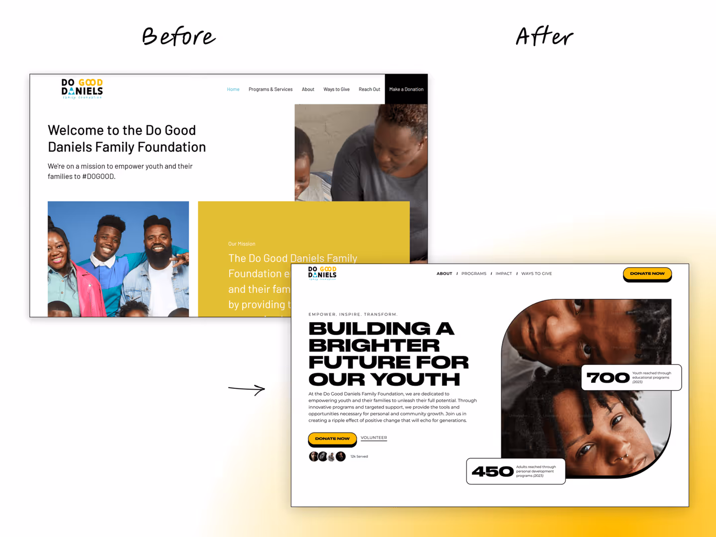
The 3-Second Test
Your homepage has three seconds to tell someone what you do, who you serve, and why it matters. Donors, journalists, and grant reviewers decide in that window whether to stay or leave.
What we usually see:
- Vague headline like "Making a difference"
- Three or four buttons competing for attention
- Rotating carousel — five messages, none land
- Stock photography that signals "we don't invest"
What great looks like:
- Headline names the problem you solve or population you serve
- One supporting sentence explaining how
- One primary call to action above the fold
- Real photography, consistent brand, clean layout
- No sliders, carousels, or auto-playing video
Reusable, Not Redundant
Build with Components, Not Pages
Designing page-by-page creates inconsistency and developer dependency. A component library gives your team reusable, accessible blocks they assemble into any page confidently.
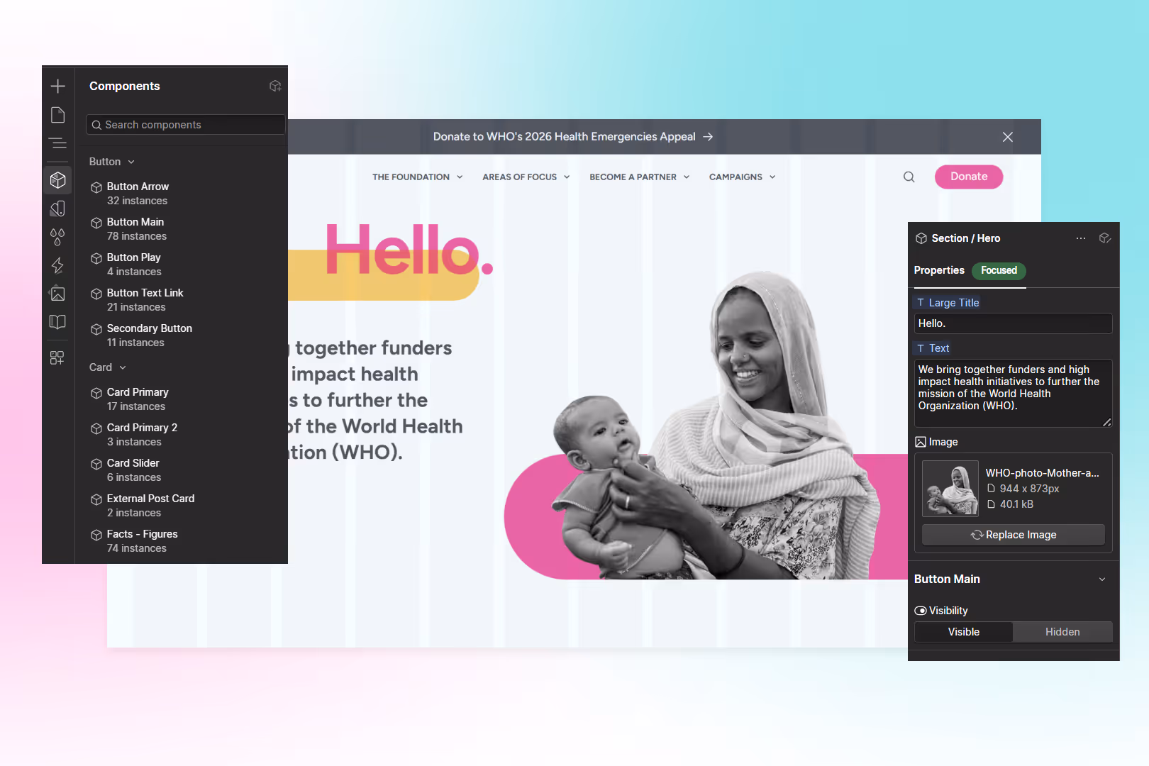

Hero Section
Clear headline, supporting text, single CTA. Configurable for homepage, campaigns, and programme pages.
Content Block
Text and image side-by-side. Reversible layout. Handles long-form programme descriptions.
Card Grid
Programmes, team, resources, news — same component, different content.
Statistics Row
Impact numbers displayed prominently. Donors scan for these.
Call to Action
Donation, contact, newsletter. One component, styled consistently, used everywhere.
Footer
Contact, sitemap, regulatory info, social proof. Donors and regulators check this.
Every Section Works
Anatomy of a Great NGO Homepage
Each section has a job. This isn't a design template — it's a functional blueprint.
Navigation
5–7 items max. Donate button distinct. No mega-menus unless 50+ pages.
Hero
Specific headline, one CTA, real photography. Most important 600px on your site.
Credibility Bar
Partner logos, accreditation badges, or a key statistic. Quiet, understated.
Stakeholder Routing
Cards that route donors, beneficiaries, media, partners to their destination in 1–2 clicks.
Impact Numbers
3–4 headline stats: people served, programmes active, countries, funds deployed.
Programme Highlights
Card grid from CMS. Current and active programmes, not historical.
Social Proof
Testimonial from donor, partner, or beneficiary. Attributed, accessible.
CTA
Repeat the primary action from the hero. Consistency reinforces the message.
Footer
Charity number, address, policies, annual report, social. Donors check this.
Inclusive By Default
Accessibility Is Not Optional
For organisations serving vulnerable populations, WCAG 2.2 is now the current standard. The requirements below cover the AA criteria that matter most for NGO websites.
Keyboard Navigation
Every menu, form, accordion, and button reachable without a mouse.
Screen Reader Support
Proper heading hierarchy, meaningful link text, ARIA labels where needed.
Colour Contrast
4.5:1 minimum ratio. No information conveyed by colour alone.
Alt Text
Every image has meaningful alt text. Decorative images marked as decorative.
Form Accessibility
Labels on every field, clear error messages, logical tab order.
Touch Targets
44×44px minimum on mobile. No pinch-zooming required.
Credible, Not Flashy
“This is a serious, well-run organisation.”
Great
- Clean typography and generous whitespace
- Professional photography of real work
- Subtle, purposeful motion
- Fast load times (under 2.5 seconds)
- Clear visual hierarchy
- Consistent brand across every page
Usual
- Cramped layouts with too many fonts
- Stock photos of diverse hands in a circle
- Scroll-triggered animations on every section
- Video backgrounds that take 8 seconds to load
- Everything competing at the same volume
- Each page designed as a standalone project
Route Everyone Efficiently
Six Audiences, One Website
Standard navigation serves one audience. Yours must route all six efficiently — each arriving with different intent, each needing three clicks or fewer to their destination.
Donors
Confidence funds are well-managed. Route to: impact, financials, governance, donate.
Beneficiaries
Access to services. Route to: programmes, resources, contact, FAQs.
Partners
Credibility and alignment. Route to: about, programmes, annual reports.
Media
Facts, fast. Route to: press section, leadership bios, key statistics.
Regulators
Compliance evidence. Route to: governance, policies, financial reports, board info.
Board Members
Confidence the org is represented well. Route to: updates, impact data, brand.
Funder-Ready Always
Transparency and Governance Built In
Sophisticated funders inspect your site before the first meeting. They check your About page, financials, board listing, and programme details.
- Board of directors with names, roles, and bios
- Annual reports and financials easily downloadable
- Programme descriptions with measurable outcomes
- Privacy and cookie policies that are current
- Contact info with a real address, not just a form
- News section updated within the last 60 days
- Leadership team with professional photos and bios
- Partnership and funder logos with attribution
Content governance means knowing who publishes what, who approves it, and how often it gets reviewed. Without this, content drifts and the site becomes a liability.
Honest Self-Assessment
Score Your Website
Score 1 point for each statement that is true today. Be honest — this is for your team.
Mission Clarity
Content & Governance
Accessibility & Performance
Team Independence
Design & Consistency
Want a professional assessment?
The scorecard gives you a starting point. The Blueprint Audit (£2,500) goes deeper — stakeholder interviews, governance analysis, accessibility audit, and a Board-ready roadmap. In 2–3 weeks, you'll know exactly what's working, what's failing, and what to do about it.
The Outcomes That Matter
What Great Looks Like
NGOs with governance-first, component-built websites all share these outcomes.
Campaigns launch in days
Comms teams create landing pages and donation flows independently.
Donors arrive trusting you
Transparency, performance, and accessibility build confidence before the first conversation.
Board shares with pride
Leadership references the website in funder meetings.
Scrutiny becomes opportunity
Journalists, regulators, and donors find credibility — not cracks.
The rebuild cycle ends
Component-first foundations evolve instead of becoming obsolete.
Mission over maintenance
No plugin conflicts, no platform firefighting. It just works.
"Working with Eric on the re-platforming of our site has been an absolute joy. He has taken what we thought would be a complex process and made it easy, seamless and professional. Even when our brief was to 'lift and shift' our site to Webflow, Eric found ways to enhance our donor experience and improve our SEO, all within budget. Our site has already had an uplift in organic traffic and our team is delighted with what we can offer our donors going forward."

A Predictable Transformation
What Changes in 90 Days
Organisations that invest in their website infrastructure properly — not just a redesign — see a predictable sequence of outcomes. Here's what that looks like.
Clarity
Complete picture of technical debt
Performance bottlenecks, accessibility failures, and content gaps — mapped, prioritised, and quantified.
Stakeholder journeys documented
Every audience — donors, beneficiaries, partners, media, regulators, board — has a mapped path from arrival to goal.
Board-ready diagnostic
A clear, non-technical summary of what's working, what's not, and what it's costing the organisation.
Foundation
Accessibility meets WCAG 2.1 AA
Keyboard navigation, screen reader support, and colour contrast resolved across all key pages.
Content governance established
Your team knows who publishes what, who approves it, and how often it's reviewed.
Mobile experience transformed
Donation flows, programme pages, and key stakeholder journeys work properly on every device.
Independence
Component library operational
Reusable, accessible blocks your team assembles into any page — campaigns, programmes, events — without developer help.
Team trained and confident
Your Comms team publishes content, launches pages, and manages the CMS independently.
Review cadence in place
Monthly rhythm of content review, performance checks, and iterative improvement — sustainable long-term.
Free Downloadable Guide
Get the Printable Guide
Download the complete guide as a PDF — plus the printable scorecard for your team. Share it with your board, your ED, or your agency.
No spam. Just the guide. Unsubscribe anytime.

Want to Talk About Your Website Infrastructure?
Socialectric works exclusively with established international NGOs — organisations where credibility is non-negotiable and the website serves multiple stakeholders simultaneously.

Monthly Partnership
30-day rolling — Monthly Partnership — Strategic Webflow infrastructure and governance support for established NGOs. One dedicated specialist. No agencies. No handoffs.

Blueprint Audit
A standalone diagnostic. Stakeholder conversations, technical audit, and a board-ready roadmap. You own the output regardless of what happens next.
Not sure what you need yet?
A 30-minute call to discuss what's working, what's not, and whether Socialectric is the right fit.