

Editor X has been replaced by Wix Studio since April 2024. Check out the in-depth exploration on Wix Studio here.
Editor X has been around for almost two years now, but it's still quite a challenge for most designers who have gotten used to the old Wix Editor. Wix is not going anywhere just yet due to its popularity and product stability, but lets assure that we will see some huge changes in the upcoming years, and it’s better to be prepared.
With this, we proudly announce our Turbo X Guide, a highly scalable and responsive web design method for Editor X. We will guide you through every single step of the process so you can build an amazing website with Editor X.
Who is Socialectric? We are a web design & development company focused on crafting meaningful user experiences. We are also an official Editor X Partner and Editor X Ambassador. We are here to help you and your web design business. We don’t charge you for all the goodies we share, but you can help us by spreading the word to the people in need.
Why should you use Editor X over Wix?
First and foremost, Wix has been around for years, with a strong community and development teams. Wix has wonderful apps that are natively built for Wix users, and it’s super easy to use. You only need to design the desktop version, then use the Optimizer button in the mobile editor to cut your development time by more than half.
You see, Editor X is a subsidiary of Wix. You can think of Editor X as a startup that is supported by an established company. With that in mind, Editor X is still relatively new and can be buggy sometimes, so you’d have to consider your project goal before deciding which platform to use.
Here are some thoughts to decide which platform is best to go with for each project:
- Does the client need responsive design? If yes, let’s go with Editor X.
- Does the client want something new out of the box? If yes, let’s go with Editor X.
- Can the client afford a higher price tag? If yes, let’s go with Editor X.
- Does the client want something stable and reliable? If yes, let’s go with Wix.
We work with the Editor X team to help them refine their product, but some features take time to debug and fix. If you are not willing to spend hours figuring out what the problem is (if it happens), then you should focus on what you know best, Wix.
Table of Contents
- Getting Started
- Style Guide Setup
- Setup Basic SEO
Getting started
To start building Editor X websites, you can create a new project and choose Editor X. If you have websites in Wix and you want to migrate to Editor X, we recommend you to rebuild everything from scratch (by following this guide). Why? While Wix offers the Wix to Editor X conversion, we have seen many users report problems during the conversion process, and oftentimes the final results were not what they expected.
There are tons of different features on Editor X that are not available in Wix, but we will not go over this in here since the Editor X team has done a great job with their tutorial videos. Check out Editor X Academy to learn more.
Step 1: Create a Style Guide
A style guide is a reference source where you collect and present all of the design decisions for your website. This ensures that all elements on the websites are consistent and cohesive with the brand you are building the website for.
To set up a style guide in Editor X, navigate to the Site Styles tab on the menu panel. You will see the Typography Styles, Color Styles, and Page Transitions tabs site wide. We start with setting up these design elements because they are crucial to keep the branding consistent.
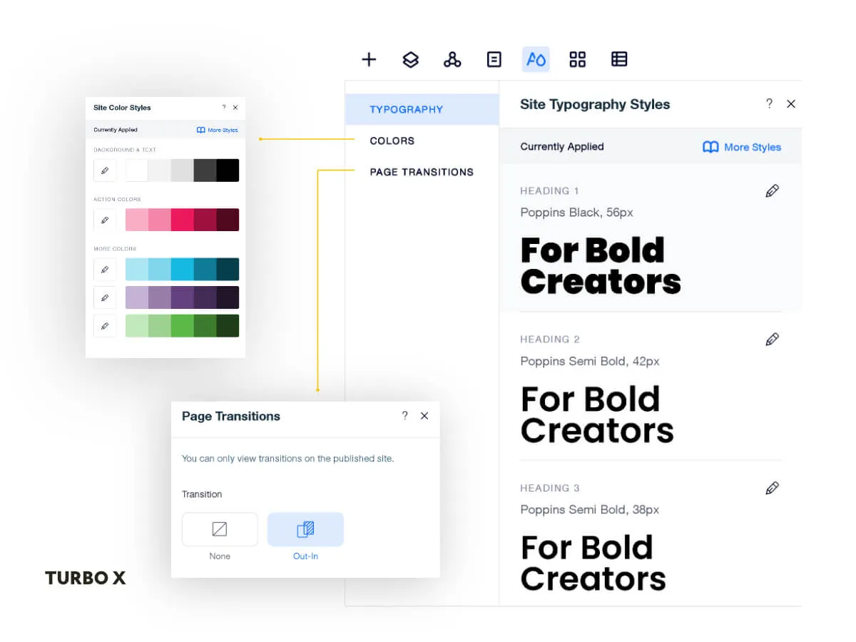
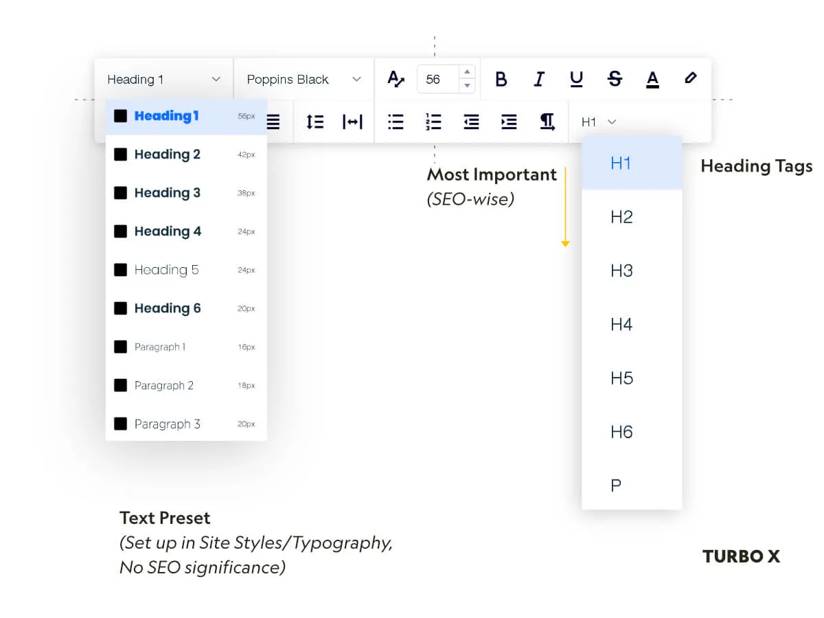
Typography Styles
In this tab, you will be able to define the font choices, font size, font weight (bold or italic), and font color. Hit Apply Style when you have finished.
Best practice to set up typography for your website
Font choice
Choose a typeface that was determined by the brand guidelines. If there is no brand guidelines, choose a typeface that aligns with the brand personality. If the business is more conservative, you may want to go with a classical serif typeface like Alegreya or Libre Baskerville. If the business is modern, check out Lato/Poppins/Montserrat.
There are plenty of free fonts available in Editor X, but you can always upload your own custom fonts if you have to.
The next step would be to choose your font size. We follow the Major Third system to choose our font size. This type scaling visualizer will come in handy when it’s time to pick the right font size. Visual hierarchy is very important in web design. You can guide the users through your website with just your text size. The bigger the font size, the more impact it will have. That’s why we often have Heading 1 as the biggest font, and it scales down from there (Heading 1 to heading 6).
For paragraph font size, most browsers have it as 16px by default. You can play around with its size but our rule of thumb is to keep it from 16px to 24px. From tablet to mobile, 14px to 16px is ideal to keep your text legible. Think of the user experience when they read on their mobile devices. You certainly don’t want them squinting their eyes or zooming in to read.
You can disregard the rem unit for now since Editor X does not support it yet.
Typography can be its own realm. There are many modern websites that are built with just types and minimal imagery, but still retain their visual impact. However, do not overuse typography by picking 10 different typefaces for your websites. The best practice is to pick one typeface for the heading, and one typeface for the body paragraph. To keep it even simpler, you can also go with just one typeface for both the heading and the body, but play with their size and weight like Bold for heading, and regular for the body paragraph. This also benefits your site SEO, less font means less weight, and your site would load faster on load.
Color Styles
Once you have done setting up the Typography Styles, you can begin to set up the Color Styles. Color is the second most important thing in web design.
You can go crazy with color because there are millions of colors to choose from. Pick the right one that is consistent with your brand.
First thing first, make sure you choose a theme, either dark or light. From there, you can proceed to pick other colors that go well with your theme. It’s a good practice to learn about color theory and their meaning, but if you can’t remember, always keep this Color Wheel in mind.
Another method to pick your website color is to go with a 60:30:10 ratio. For example, if you go with a dark theme like us, here’s how we structure our color throughout our website.
- Black (60%) - Background (Dominant color)
- White (30%) - Text (Secondary color)
- Yellow (10%) - Button (Accent color)
You can choose up to 5 hues, and each row will have 5 different shades of colors. It’s great that Editor X generates those extra colors for you, but you can get overwhelmed by the choices and mess up your design. Keep it simple, 3 colors, maybe add in some neutral colors if you are more experienced.
Page Transitions
Unlike Wix, there’s only one page transition, In & Out, in Editor X. You can choose to set it to none if you don’t like a flash on your website when you click through another web page.
Now that’s step 1, let’s move on to step 2.
Step 2: Begin the design
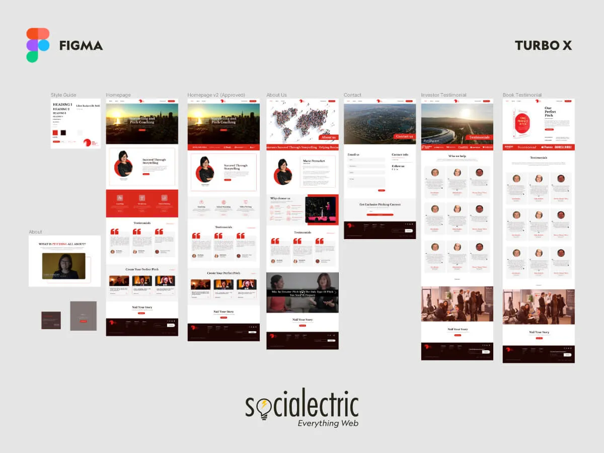
We generally prefer to design our client websites on design tools like Figma, We know many designers like to design directly on Wix and Editor X, but it’s a big no-no for us., and it is due to various reasons:
- It’s easier to see the big picture using a design tool dedicated to design such as the overall art direction and user flow.
- You can receive client’s feedback directly on the design, and get their approval first.
- It’s easier to make design changes.
Regardless, it’s our standard approach when it comes to web design. We used to try to design directly on Editor X, but the revisions became exhausting and very frustrating.
Think of the design as a blueprint, you can build the site much faster if you already have the blueprint. Like architecture, we haven’t seen one that was built without a design and detailed calculated blueprint. Once you have the blueprint, you would begin to build the foundation of the building and proceed from there. The last step would be polishing your website by giving it additional final touch at the end.
Best practice
We use Figma to design our websites and get client’s approval first before we proceed to the site development in Editor X.
During the design phase, it’s good if you know what the platform allows you to do, but not necessarily. We wouldn’t design a crazy on scroll animation just to realize it cannot be built on Editor X in the end. This is something for you to keep in mind. Maybe you can, but it can take you more time and may not be feasible.
Step 3: Our favorite step. The Development phase.
The selling point of Editor X over Wix is the ability to build responsive websites, where your website can scale to fit any device sizes, with ease. It’s time for you to get used to some terminology when it comes to responsive design in Editor X.
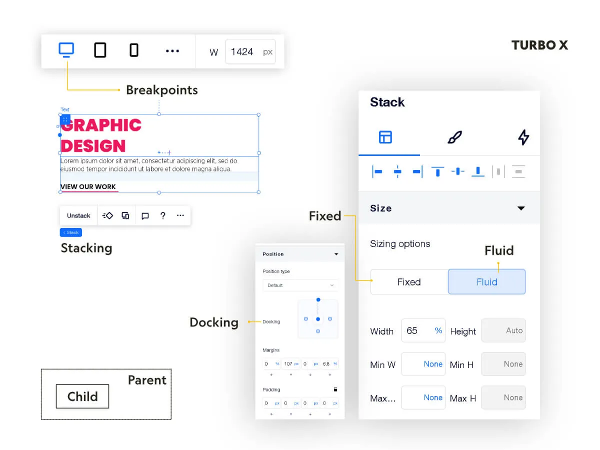
You will find that we use Fixed and Fluid terminology all the time. These settings can be found in the Inspector Panel on the right side of your Editor:
- Fixed: This option keeps the width of the element the same across all viewports. It doesn't shrink or grow according to screen size.
- Fluid: This option adjusts the width - and sometimes the height - of elements depending on the screen size.
- Breakpoints: A breakpoint is a specific size that applies style changes to a specific width so a site can be responsive as it scales up and down. Changes you make from larger breakpoints will cascade downward to smaller breakpoints.
- Stacking: When you stack elements together, you ensure their composition is flawless in every screen size.
- Docking: Docking determines the vertical and horizontal position of elements within the page section, container or grid cell when the screen is resized.
We highly suggest that you watch all the videos from Academy X from Editor X. It will help you build a foundation before you continue with our guide.
The Box Model
This is something you should get yourself familiar with when you deal with responsive design. To make it easy to understand, we have attached a simple illustration below:
On the desktop breakpoint, you have 2 boxes side by side. You can add some content on the left box, and an image on the right box.
On a mobile breakpoint, you can move the right box to the bottom, stacking two boxes together so it fits the long vertical screen of the mobile phones.
Best practice
If you adhere to the box model, you can build your website with extreme precision yet minimal effort. Assess your design blueprint before you proceed with the build so you map out a roadmap of the best layout to approach.
To do this, you can take advantage of the CSS Grid that Editor X has to offer. The first thing you’d do is to add a section, you can do this by clicking the (+) icon when you hover over canvas.
Parent/Child Relationship
A website has its own structural hierarchy. You have a body (the canvas as a whole), sections within the canvas, smaller containers within the sections, and last but not least, the site elements (heading/paragraph/images).
This parent and child relationship is very important in responsive design. If this structure is broken, your entire website will change. For example, you want to move the text inside a container to a certain position on site, and you accidentally move this text block out of its parent container. This breaks the parent/child relationship, and the text block element has now been moved to another location on the page (desktop/tablet/mobile).
To prevent this from happening, usually when you want to reposition an element in a grid on mobile, we recommend you to use Grid Area (the bottom most setting on the Inspector Panel).
CSS Grid
Once you add the section, you can add a grid. We want a 2-column section, you would choose 2 columns. When it comes to mobile responsiveness, navigate to the mobile breakpoint, and you can click on that section again to choose “Adjust Grid.” You will see the suggestion to choose a vertical 2-row option instead. Once clicked, Editor X automatically adjusts your design so it fits the mobile screen size vertically.
Best practice
We often add 2 more columns (5% width) on each edge of the section. This ensures that our content will never hit the edge of the screen. If you don’t want to do this, you can choose your content elements and set their width to 90%.
For more complex builds, like this template from Editor X, you will be using a CSS grid in conjunction with Sticky Position properties. It can get very difficult to manage a design like this, and you certainly cannot use Drag and Drop to build a site that requires extreme precision.
Other properties in CSS Grid that you should consider are the min/max content, auto, fr, and %. You will find yourself rarely working with pixels (px) and working with relative units more often, since that’s the way to build a completely responsive website.
Extreme Precision
Drag and drop is the best feature on Wix and Editor X, it makes life so much easier when you want to make new changes. However, it is also a pitfall that most Wix/Editor X designers got into.
Editor X allows you to precisely control the position of each element, and to do this, you will have to get used to the numbers.
When you share the site with your clients, you quickly get feedback where you don’t understand why you put the text block in the middle of the screen yet it’s way off to the left (per client’s feedback). This is because Editor X is responsive, and so is their editor.
As you set the text block in the center of your screen, let’s say 1200 px, it is not centered on the client’s big monitor of 1920px and 2560px.
To fix this, you will have to navigate to the Inspector Panel and set the docking to the center. The default docking is top and left. As soon as you add a new element on the canvas, it automatically docks to the top and left of the section. In addition, you will need to change your docking to percentage.
Similarly, your element width, height, margin, and padding can all be set to relative units where it is responsive as the screen size changes.
Relative unit in Editor X: %, vw, vh, fr
Fixed unit in Editor X: px
The Secret Sauce
Here are some of the best secrets we use to speed up our development time (on the Inspector Panel). Editor X creates these just for you, so make sure you use them.
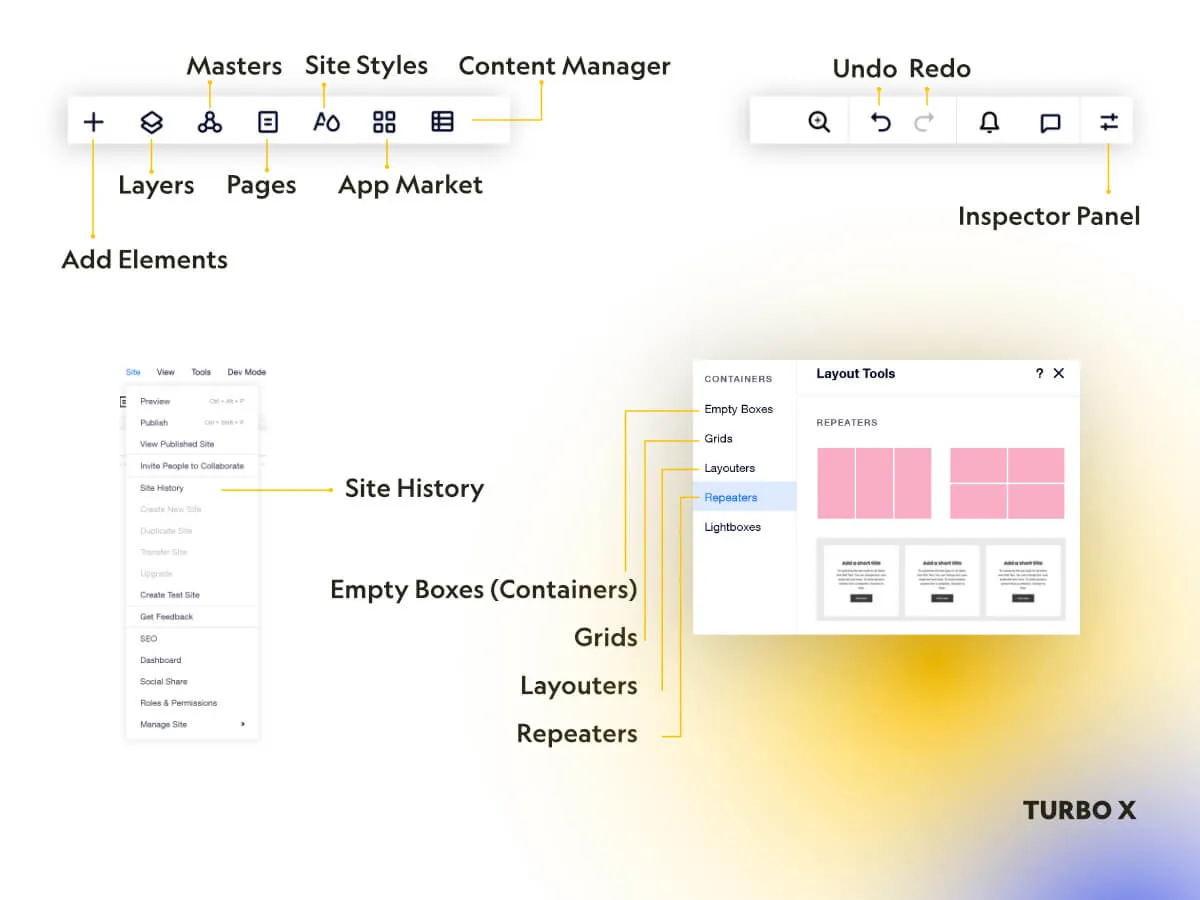
- Alignment - We use this whenever we want an element to align to certain points (left, right, center, middle). This property is very useful when you have elements stacked together. The alignment will happen within that stack, so you can fast forward your workflow.
- Stacking spacing - When elements are stacked together, you can now choose the spacing between them with just one click.
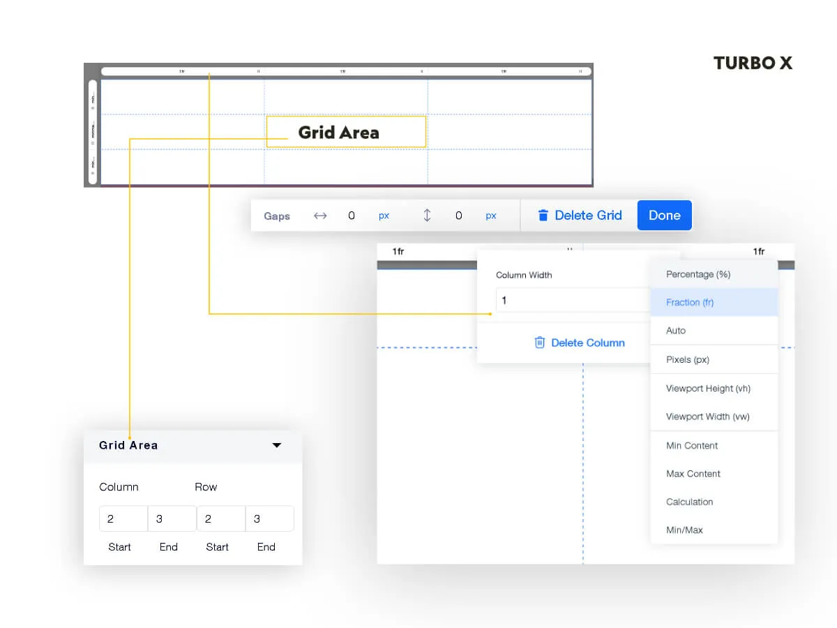
- Grid Area - When you have CSS Grid, it’s recommended that you use Grid Area (near the bottom of the Inspector Panel). You have 4 boxes: first column, last column, first row, last row. This allows you to move elements around your grid matrix. All you have to do is to figure out its position and type in the number in the Grid Area. You no longer have to be afraid of moving things around and ruining your layout.
- Place in Container - These elements come in handy when you need to place a new container outside a bunch of elements, or remove a container with just one click. There were cases where designers tried to move a container around and it destroyed their responsive layouts (Select two elements at the same time you will see a panel that allows you to Place in Container).
- Layers - This comes in handy when you have a dense design. Elements can get overlapped, but the layer panel will help you find the element super quickly.
- Repeater - We use this every time when elements have the same design but different content. It will help to reduce the repeated steps if you have to change something to the design. For example, if you make a change to one card (out of 3), the other two cards will change accordingly.
- Layouter - We rarely use this, but this element will help you achieve different type of layouts for your gallery.
- Text Scale - Available for both heading text and body text. The default setting is just one fixed unit, but you can choose the text scale icon next to it to start using the responsive text. You can set a range of how large the text will get to, or how small it will shrink to. For body paragraph, we usually use 16 - 24px for all 3 breakpoints
- Image Stretched- Use this if you want your image to scale proportionately. This means your image can get cropped off, but you will be able to choose the focal point of the image where this area will never come out of focus no matter how large or how small your breakpoint is. If you don't want your image to get cropped, you can set the image width to 100% to keep the image ratio while the image fills the entire container.
Important tips: We never add more than the 3 default breakpoints. This helps to keep your site manageable and avoid unnecessary headaches.
Step 4: Build Websites with SEO in mind
SEO allows the search engines to index your website easier.
How do you build a website with SEO in mind?
Build your website like you are writing an article. Heading 1 will be the largest heading that contains the main keyword for that web page. Heading 2 will be a bullet point that supports your big idea. And it just goes down from there, H1 - H6, the main idea to the smallest ideas. The rest will be your paragraphs.
For example,
H1: We Sell Supercar in Southern California with Free Test Drive
_H2: Lamborghini Aventador
__H3: Scissor doors
_H2: Rolls-Royce Phantom
__H3: Suicide doors
We can go deep with SEO, but the most basic one is to have the correct heading tags on each of your web pages.
This guide is perfect for beginners who just want to try out Editor X. As the platform grows, we will continue to update this TurboX guide and give you the best practice of how you can build your own Editor X websites.


.webp)