Wix Studio represents a significant shift for Wix, targeting agencies and freelancers with advanced features that blend the best aspects of both Wix and Editor X. Unlike its predecessors, Wix Studio aims to cater to professionals who require high-performance, stable platforms for designing and building websites for clients. This strategic repositioning acknowledges the need for expertise in web design and development, moving away from trying to educate the average user on complex web mechanics.
Editor X, despite its innovative approach with responsive layouts and CSS precision, faced challenges, particularly with breakpoint adjustments and other bugs. However, these issues have helped inform the development of Wix Studio, which promises a more reliable and efficient platform. The move to replace both Editor X and the traditional Wix platform with Wix Studio by 2024 allows Wix to consolidate their offerings and focus on creating a superior product.
While Wix Studio still has room for growth to match the capabilities of competitors like Webflow, it is clearly targeted at a different audience. The focus on agencies and professionals suggests a tailored approach, catering to users who value advanced design capabilities and streamlined business management tools. This strategy reflects Wix's understanding that even the most intuitive platforms benefit from professional expertise to achieve optimal results.
Wix Studio: Key Features and Capabilities
1. Design Capabilities (Styling)
Wix Studio offers robust design capabilities, providing tools for advanced styling and layout design. The platform features responsive design elements, allowing users to create adaptable layouts that automatically adjust to different screen sizes. Users can achieve precision in styling through CSS, with detailed control over margins, padding, and other styling properties. Additionally, the platform supports a smooth drag-and-drop interface, making it easy to create and modify visual elements.
2. Development Capabilities (Custom Code, Animation)
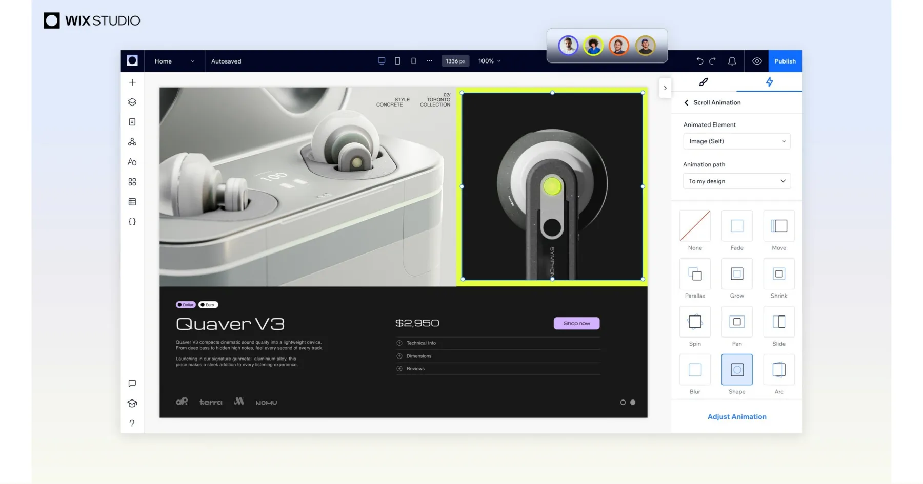
Wix Studio provides extensive development capabilities, including the ability to add custom code (HTML, CSS, JavaScript) to enhance website functionality. This allows developers to integrate unique features and third-party tools. The platform also includes animation tools, enabling users to create dynamic, interactive elements that enhance user experience. These animations can be customized and triggered based on user interactions or scroll positions.
3. Hosting Plans
Wix Studio offers a variety of hosting plans tailored to different business needs. These plans typically include features like unlimited bandwidth, increased storage, and advanced security measures. Hosting on Wix Studio is fully managed, ensuring that websites are secure and running optimally. The platform also includes integrated SSL certificates for secure data transmission.
4. Collaboration
Wix Studio supports collaboration features, making it easier for teams to work together on projects. Multiple users can be invited to work on the same project, with specific roles and permissions assigned to control access and editing capabilities. This is particularly useful for agencies and businesses working with multiple stakeholders.
5. Editability
The platform offers extensive editability, allowing for both visual and code-based editing. Users can make real-time changes and see them reflected immediately, providing a seamless editing experience. Wix Studio also includes version control, enabling users to revert to previous versions of the website if needed.
6. Project Transfer and Roles Management
Wix Studio simplifies project transfer and roles management, allowing users to easily transfer ownership of a project to another account. This feature is particularly beneficial for agencies handing off completed projects to clients. The platform also offers detailed roles management, allowing for the assignment of specific permissions to different team members.
7. SEO
Wix Studio includes comprehensive SEO tools, helping users optimize their websites for search engines. These tools cover basic SEO elements like meta tags, alt text for images, and URL customization, as well as more advanced features like structured data and 301 redirects. The platform also provides SEO analytics, allowing users to track their site's performance and make data-driven improvements.
8. App Market
The App Market in Wix Studio offers a wide range of third-party integrations and add-ons. Users can enhance their websites with additional functionalities, such as booking systems, chatbots, and marketing tools. This flexibility allows businesses to customize their site to fit specific needs and improve user engagement.
9. eCommerce
Wix Studio includes robust eCommerce capabilities, enabling users to set up online stores with ease. Features include product management, inventory tracking, secure payment gateways, and customizable checkout experiences. The platform also supports various business models, such as physical products, digital downloads, and services.
10. Community
Wix Studio fosters a strong community of users and developers. This community provides support, resources, and inspiration for users looking to enhance their website projects. The platform offers forums, tutorials, and webinars, helping users to learn new skills and stay updated on the latest features. Additionally, the Wix Expert community connects users with professional designers and developers for hire.
History of Wix Studio and Its Origins
Wix Studio began as a solution to a common problem: the need for a user-friendly platform that allows individuals to create their own professional-looking websites without needing to know how to code. The idea was born from the frustration of small business owners who were trying to establish an online presence but found the available tools too complex or too expensive.
The founders of Wix, Avishai Abrahami, Nadav Abrahami, and Giora Kaplan, realized this gap in the market back in 2006. They set out to develop a platform that would be accessible to anyone, regardless of technical skill. Their vision was to simplify the process of website creation so that users could focus on the content and design of their sites, rather than the backend coding.
In its early days, Wix used Adobe Flash to power its website builder, which allowed for a high level of design flexibility. However, as technology evolved and mobile browsing became more prevalent, Wix shifted to an HTML5-based platform, ensuring that websites built with their tool were compatible with all devices.
Today, Wix Studio not only offers a drag-and-drop website builder but also a suite of products that cater to various online needs, including e-commerce, online marketing, and search engine optimization. It has become a comprehensive solution for individuals and businesses looking to establish and grow their online presence.
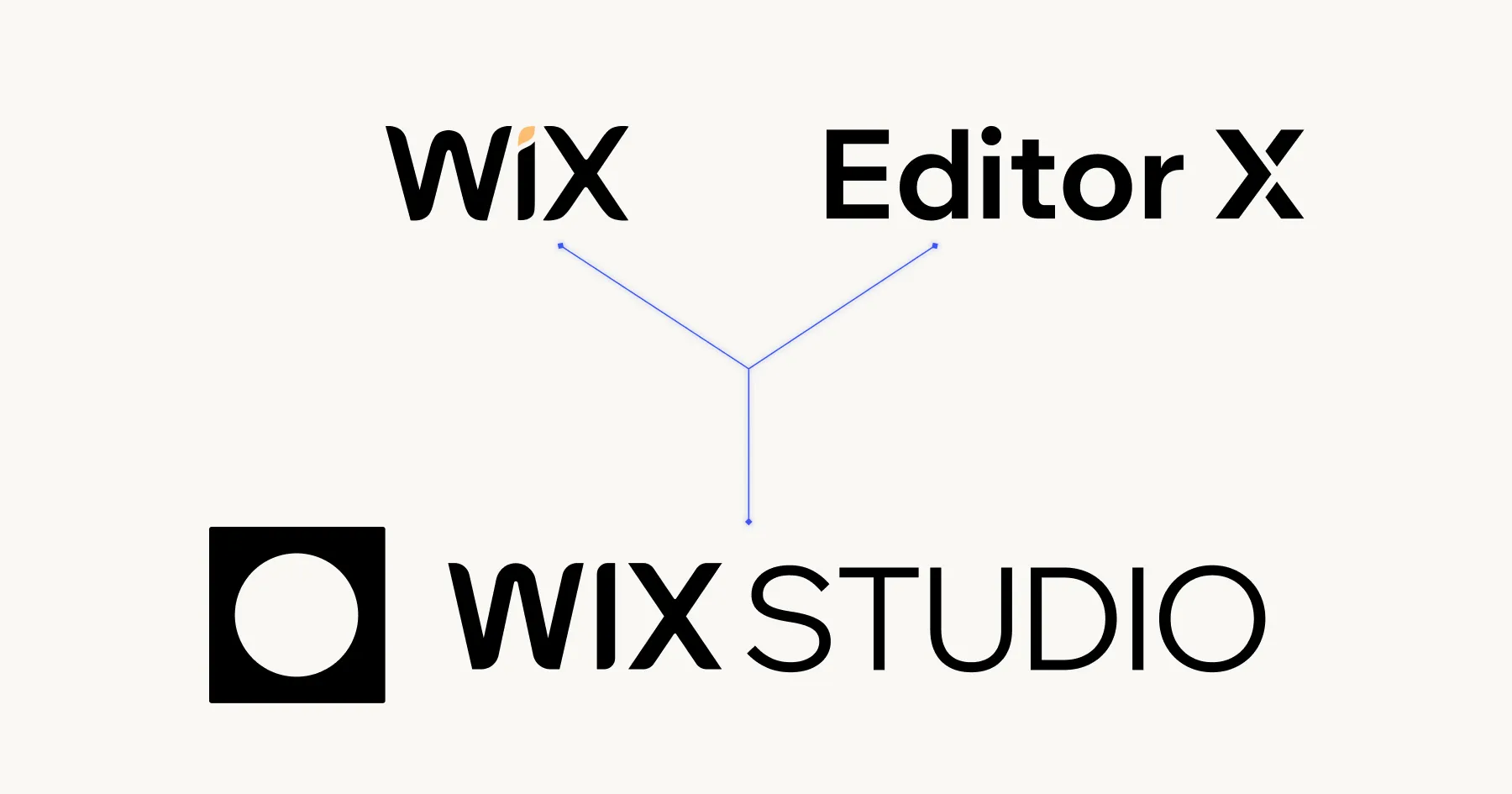
Wix Studio: The Best of Wix Editor and Editor X Combined
Wix Studio's development represents a synthesis of the strengths from both Wix Editor and Editor X, while addressing their respective limitations.
Wix Editor: Simplicity with Limitations
Wix Editor was designed with ease of use in mind, making it accessible for users with little to no coding experience. Key features and limitations included:
- Simplicity and Accessibility: Its user-friendly interface allowed users to drag and drop elements easily, without needing technical knowledge.
- Lack of Modern Web Development Features: It struggled with modern web design needs, particularly in responsiveness. It lacked breakpoints for different screen sizes, meaning websites often did not adapt well to various devices.
- Limited Custom Code Integration: Customization was restricted, with auto-generated class names making it difficult to apply specific CSS changes. This limitation hindered advanced customizations and made precise control over the design challenging.
- Basic Interactions: The platform offered limited interaction capabilities, mostly restricted to simple, time-based animations without complex triggers or responsive actions.
Editor X: Advanced Features with Challenges
Released in 2020, Editor X aimed to compete with platforms like Webflow by offering more advanced web development capabilities. However, it had its own set of challenges:
- Advanced Responsiveness: Editor X introduced essential features for modern web design, such as breakpoints, CSS grid, and flexbox layouts. These allowed for more granular control over the responsiveness of images and sections across different devices.
- Enhanced Interactions: The new interactions tab allowed for more complex animations and interactions, such as click events and parallax effects (e.g., background images reacting to mouse scrolls).
- Custom Code and CSS Flexibility: Unlike Wix Editor, Editor X provided the ability to use CSS for detailed styling, offering more freedom in customizing website elements.
- Performance and Stability Issues: Despite these advanced features, users often faced frustration due to bugs and performance issues. The editor could become slow and unresponsive, especially with complex designs and scaling, leading to a less-than-optimal user experience.
Wix Studio: Combining the Best Features
Wix Studio marks a significant upgrade from its predecessors, Wix Editor and Editor X. It integrates the user-friendly nature of Wix Editor with the advanced features of Editor X, particularly in responsiveness and customization capabilities. Here's a breakdown of its new and improved features:
Enhanced Editor Interface and Performance
1. Combined Features
The interface combines the simplicity of Wix Editor with advanced features from Editor X, such as breakpoint control for responsive design. This blend offers a more intuitive experience while providing the necessary tools for professional-grade web design.
2. Improved Performance
The editor is notably faster and more stable, addressing previous issues of sluggishness and unresponsiveness found in Editor X.
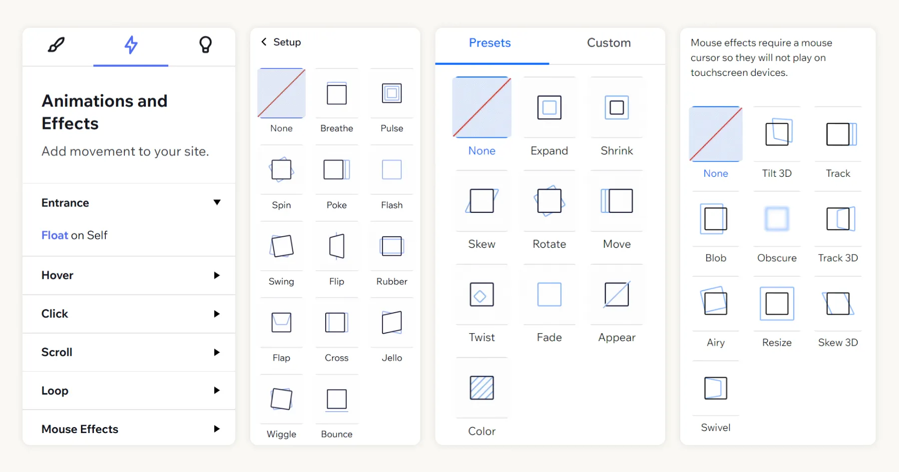
Advanced Animations and Effects
One of the standout features of Wix Studio is its ability to create complex interactions and animations without any coding. This is a significant advantage for users who may not have coding expertise, making advanced web design accessible to a broader audience. In contrast, platforms like Webflow often require a certain level of coding knowledge for similar effects.
1. New Animations and Effects Tab
This new feature-rich tab allows users to add a variety of animations and effects without needing any coding skills. Options include:
2. Scroll-based Interactions
- Develop immersive experiences that engage users by incorporating scroll-triggered animations. For instance, consider implementing parallax backgrounds that move slower than the foreground, creating an illusion of depth as you scroll down the page.
- Craft elements that smoothly transition into the user's view when they reach a particular section. This visual cue signifies new content and keeps the user interested in continuing their journey through your website.
3. Entrance Animations
- Captivate your audience immediately with eye-catching entrance animations. When a user navigates to a new page or section, elements can gracefully glide, fade, or bounce into place, capturing attention and providing a seamless and dynamic user experience.
4. Hover and Click Effects
- Enhance the interactivity of your site by designing hover and click animations that give real-time feedback to users. This could range from subtle text color changes to complex animation sequences, ensuring that each interaction is meaningful and encouraging users to engage further.
5. Loop and Mouse Effects:
- Introduce perpetual motion on your site with looping animations that keep visual interest alive. From spinning graphics to gently swaying objects, these constant movements create a lively atmosphere.
- Build a connection between the cursor and the digital environment with mouse-dependent animations. As the cursor moves across different sections, it can trigger unique animations or visual distortions, delivering an engaging and reactive experience to the user.
Typography and Style Controls
1. Min-Max Font Size Options
The Inspector Panel now includes options for setting minimum and maximum font sizes, facilitating fluid typography that adapts to different screen sizes and devices.
2. Typography Site Styles
Users can define consistent typography styles across their site, ensuring a cohesive look and feel. This feature simplifies the management of text styles and improves the overall aesthetic quality of the website.
Wix Editor and Editor X - One Click Migration to Wix Studio
In late June, Wix introduced a seamless migration feature, allowing users to transition from Wix Editor and Editor X to the new Wix Studio with just one click. This migration capability is particularly useful for users looking to upgrade their existing sites to take advantage of the enhanced features and improved performance that Wix Studio offers.
Migration Feature
1. One-Click Migration
Wix has made it incredibly easy for users to move their sites from Wix Editor and Editor X to Wix Studio. The one-click migration tool ensures a smooth and efficient transition, preserving the existing content and structure of the websites.
2. Considerations for Complex Sites
For more complex websites, particularly those with extensive customizations and advanced features, it may be more beneficial to rebuild the site from scratch in Wix Studio. This approach allows users to fully leverage the new tools and capabilities offered by Wix Studio, such as advanced animations, responsive design elements, and more comprehensive styling options.
User Experience and Feedback
With experience in both Wix and Webflow, users have expressed their admiration for how Wix has implemented this migration process. The ease of upgrading and the potential to enhance websites with Wix Studio's new features have been particularly well-received. Users appreciate the effort Wix has put into creating a platform that not only bridges the gap between its previous editors but also pushes the boundaries of web design and development capabilities.
Comprehensive Digital Transformation Suite
Wix has expanded its offerings to provide a comprehensive suite of tools and services aimed at facilitating digital transformation for businesses and individuals. This suite includes a wide range of features that go beyond basic website building, catering to various aspects of online presence and business management. Here’s an overview of the additional services and tools provided by Wix.
1. Automation
Wix offers automation tools that streamline business processes. These include automated workflows for tasks such as email notifications, customer engagement, and lead management, helping businesses save time and enhance efficiency.
2. Email Marketing
The platform includes powerful email marketing capabilities, enabling users to create and send professional email campaigns. Users can manage mailing lists, segment audiences, and track campaign performance, all integrated within the Wix environment.
3. Invoices
Wix provides tools for generating and managing invoices, making it easy for businesses to bill clients and keep track of payments. This feature is particularly useful for freelancers and service-based businesses.
4. Domain and Web Hosting
Wix offers domain registration and hosting services, allowing users to manage their website’s domain and hosting directly through the platform. This integration simplifies the setup process and ensures that all aspects of a website’s online presence are managed in one place.
5. Marketplace for Designers and Developers
The Wix Marketplace connects users with professional designers and developers who can assist with custom projects. This marketplace is a valuable resource for businesses seeking expert help to enhance their websites.
6. Development Environment for Tech-Savvy Developers
For more technically inclined users, Wix provides a development environment that supports custom code and advanced development features. This includes access to APIs, custom integrations, and the ability to build complex web applications.
7. Subscriptions and Vouchers
Wix supports subscription-based business models, allowing users to offer services or products on a recurring basis. Additionally, the platform enables the creation and management of vouchers and discounts, which can be used to attract and retain customers.
8. Marketplace for Custom Apps
Users can extend their website’s functionality through the Wix App Market, which offers a variety of custom apps. These apps cover a wide range of needs, from eCommerce solutions to booking systems and more.
9. Roles Management Suite for Agencies and Clients
Wix includes a robust roles management system that is particularly useful for agencies working with multiple clients. This system allows for the assignment of different roles and permissions, ensuring that team members and clients have appropriate access and control over the website and its content.
10. Create and Sell Custom Templates
Designers can create custom website templates using Wix's design tools and then sell these templates through the Wix Marketplace. This provides a new revenue stream for designers and enables them to showcase their creativity and design skills to a broader audience.
11. Image Editing Suite
Wix Studio now includes a powerful image editing suite, providing tools such as background removal, brightness and contrast adjustments, cropping, and resizing. This suite allows users to customize images directly within the editor, streamlining the design process and eliminating the need for external software.
Empower Your Web Design with Wix AI: Smart, Responsive, and Effortless
Wix AI enhances the website building process with advanced AI capabilities:
1. AI-Powered Design Assistant
It generates personalized website designs based on user preferences and industry standards, providing a starting point that matches the user's needs.
2. Content Suggestions and Generation
The tool can create relevant content, including text, images, and videos, tailored to the user's business and target audience.
3. Code Assistance and Breakpoint Responsiveness
Wix AI assists with writing code snippets and adjusting website elements for responsiveness across different devices and screen sizes, ensuring a seamless user experience.
4. Automated SEO and Analytics
It offers real-time SEO optimization tips and performance analytics, helping users improve visibility and engagement.

Potential Improvements for Wix Studio
1. Breakpoint-Specific Font Size Control
Introduce the ability to set custom min-max font sizes for different breakpoints in the Site Typography Styles, allowing for more precise control over typography across various devices.
2. Reusable Interactions
Implement a system for saving and reusing interaction settings across different elements, streamlining the process of applying consistent animations and effects.
3. Custom CSS Naming
Provide a standardized CSS naming convention that aligns with the Velo Developer guide, making it easier to style elements with custom CSS.
4. External Code Integration
Facilitate the use of external code repositories like GitHub or CodePen, possibly through a community-driven knowledge base, to encourage sharing and implementation of custom code solutions.
These improvements could further align Wix Studio with professional-grade web design platforms, enhancing its appeal and functionality for advanced users.
Ready to Jump Start Your Business?
Socialectric is a world-leading website design and development studio, empowering creative agencies and small businesses to enhance customer experiences, drive digital transformation, and build a competitive edge. If you're ready to take your digital presence to the next level, learn more about how the top website design and development studio to work with.